Blog
Did You Add Cash? When to Use CAGR vs IRR
By MarketCapLens · Published · 11 min read

Use CAGR when you’re measuring the growth of a single lump sum with no money moving in or out along the way. Use IRR, or its spreadsheet cousin XIRR, when contributions or withdrawals happened at different dates, because it weights each cash flow by size and timing. The two produce identical numbers only in the lump-sum case. The worked examples and Excel formulas below show exactly where they differ.
TL;DR:
- CAGR is appropriate for measuring assets held as a lump sum without interim cash flows, while IRR and XIRR account for contributions or withdrawals at different times.
- IRR assumes reinvestment at the same rate and can produce multiple answers or be unstable when cash flows switch signs more than once, unlike CAGR.
- For personal portfolios with irregular contributions, XIRR provides the most accurate return measure, reflecting actual cash flow timing.
- Comparing a fund’s published CAGR with your personal performance requires adjusting for cash flow timing, making XIRR necessary if contributions are frequent.
- Always pair return metrics with volatility or drawdown figures to understand the risk taken to achieve those returns.
MarketcaplensCompare Returns With Market ContextExplore historical data, market trends, and sector allocations across more than 2,500 public companies to support your return analysis.Explore MarketCapLens
Table of Contents
- CAGR vs. IRR: Formulas and Excel Shortcuts
- Why CAGR and IRR Tell Different Stories
- Decision Checklist: Which Metric Fits Your Question
- How to Calculate CAGR, IRR, and XIRR With Real Numbers
- Common Mistakes That Distort Your Return Numbers
- How MarketCapLens Reports Historical Returns
- CAGR, IRR, and the Portfolio-vs-Single-Asset Problem
- When IRR Has No Single Answer
- Using CAGR and IRR to Benchmark Against the Market
- Cash Flow Timing and Why IRR Can Be Unstable
- The One Rule Worth Remembering
- Check Asset-Level Returns Before You Calculate Your Own
- Sources
- FAQ
CAGR vs. IRR: Formulas and Excel Shortcuts
CAGR compresses a multi-year change into one smoothed annual growth rate. The formula is (Ending Value / Beginning Value)^(1/Number of Years) minus 1, and it’s best suited to assets held as a lump sum without interim cash flows, like a single stock purchase you never added to.
IRR is different math for a different job. It’s the discount rate that sets the net present value of a series of cash flows to zero, which matters once money enters or leaves the investment more than twice. XIRR extends that logic to real calendars, since it accounts for the actual dates of each cash flow rather than assuming they’re evenly spaced.
In a spreadsheet, the three functions you need are:
- RRI: computes CAGR directly from beginning value, ending value, and number of periods.
- IRR: solves for the periodic rate assuming evenly spaced cash flows.
- XIRR: solves for the annualized rate using actual dates, which is what you want for real personal portfolios with irregular deposits.
The conceptual gap between them comes down to reinvestment. IRR assumes every interim cash flow gets reinvested at the IRR itself, an assumption CAGR never makes because there’s nothing to reinvest.
Why CAGR and IRR Tell Different Stories
CAGR flattens a bumpy ride into a straight line. A stock that gained 40% one year and lost 20% the next can post the same CAGR as one that grew steadily at 8% a year, because CAGR is a geometric average that erases the path entirely. That’s a feature for comparing endpoints and a liability if you care about how rough the ride was.
IRR does the opposite. It weights every cash flow by size and by how long it sat in the investment, so a large contribution right before a market spike can swing IRR dramatically even if the underlying asset’s CAGR barely moved.
- The two metrics match exactly when there’s one inflow, one outflow, and nothing in between.
- They diverge once you add systematic contributions, partial withdrawals, or lump sums added mid-stream.
- IRR can produce more than one mathematically valid answer when cash flows flip from negative to positive more than once, an edge case tied directly to its reinvestment assumption.
Here’s a case worth sitting with: a fund’s headline CAGR and an individual investor’s XIRR on the same fund can differ by several percentage points, purely because of when that investor’s money went in. Same fund, same underlying returns, different personal outcome. Neither CAGR nor IRR measures risk on its own, so pairing either with a volatility or drawdown figure is not optional if you want the full picture.
Decision Checklist: Which Metric Fits Your Question
Run through this before you calculate anything:
- Am I comparing an asset to itself over time, with no added money? Use CAGR. It’s the standard for a stock, an index, or a fund’s published track record.
- Am I measuring my own portfolio, where I added or pulled out cash at different times? Use XIRR. It’s the only one of the two that reflects your actual timing.
- Am I evaluating a private deal or project with staged cash flows? Use IRR alongside the cash multiple, since IRR alone can flatter a deal that returned money quickly but not by much.
- Am I reading a fund fact sheet? Assume it’s reporting CAGR at the fund level, not your personal XIRR.
Reporting conventions follow this same split: fund fact sheets almost always lead with CAGR because they’re describing the fund, not any one investor’s experience. Deal sponsors and private equity reports lean on IRR plus a cash multiple, because a single rate without the multiple hides whether the return came from real dollars or just clever timing.
Pro Tip: If you only remember one question, make it this: “Did money move in or out after day one?” If yes, CAGR is the wrong tool no matter how convenient it looks.
How to Calculate CAGR, IRR, and XIRR With Real Numbers
Example A: Lump sum, no interim flows. You invest $10,000 and it grows to $16,105 over five years, with nothing added or withdrawn.
- CAGR: (16,105 / 10,000)^(1/5) − 1 = 10%
- Excel:
=RRI(5,10000,16105)returns the same 10% - IRR on the same two cash flows (−10,000 at year 0, +16,105 at year 5) also returns 10%
That equivalence isn’t a coincidence. With exactly one inflow and one outflow, IRR and CAGR are mathematically the same calculation dressed in different formulas.
Example B: Monthly contributions. You put $500 into an investment on the first of each month for three years, ending with a portfolio worth $20,000.
The naive CAGR calculation above treats $18,000 as if it sat invested for the full three years, which it didn’t. Most of it arrived in the final year. Applying a fund’s advertised CAGR to a series of monthly contributions usually overstates or understates your personal return, depending on whether your later contributions caught a rally or a slump. XIRR is the only calculation that accounts for each dollar’s actual time in the market.

Common Mistakes That Distort Your Return Numbers
The single most frequent error: treating a fund’s published CAGR as your own return when you invested through systematic contributions rather than one lump sum. It almost never matches.
- Don’t apply CAGR to any account that had more than one cash flow.
- Don’t treat an IRR calculated over a very short period, on a small amount of money, as durable. IRR assumes reinvestment at that same rate, and a strong short-term number rarely holds up.
- Do sanity-check your CAGR by reconstructing the ending value from the beginning value and the rate. If it doesn’t match, an input is wrong.
- Do check the cash multiple alongside IRR. A reasonable sanity check catches most spreadsheet input errors before they become a wrong conclusion.
Pro Tip: *If your IRR looks unusually high, check the holding period first.
How MarketCapLens Reports Historical Returns
Historical performance figures on MarketCapLens describe the asset itself, the CAGR-style growth of a company or sector over time, not any individual investor’s experience with it.
- If you bought in gradually or added money at different points, your personal return needs XIRR, not the asset-level figure you see published.
- Pages like AI stocks by market cap and five-year returns show sector-level growth patterns, useful for comparing companies but not a substitute for tracking your own contributions.
- Always check whether a quoted return is gross or net of fees before you compare it to your own XIRR, since fee drag can explain part of any gap.
CAGR, IRR, and the Portfolio-vs-Single-Asset Problem
CAGR works cleanly for one asset because there’s one beginning value, one ending value, and one clean timeline. A portfolio holding a dozen positions, each bought and sold at different times, breaks that clean structure immediately.
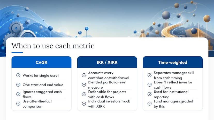
Applying a single CAGR to a portfolio’s total value ignores that some money sat invested for six years while other money arrived eighteen months ago. That’s where IRR, calculated at the portfolio level using every contribution and withdrawal across every holding, becomes the only honest measure of blended performance. Institutional reporting handles this with a related but distinct approach: time-weighted returns separate a manager’s skill from the investor’s own cash-flow timing, which is why fund managers are graded on time-weighted returns while individual investors should track their own results with XIRR.
For comparing individual projects or investments against each other, say, two rental properties or two private deals, IRR is the more defensible metric because each project likely has its own staggered cash flow schedule (down payment, renovation costs, rental income, eventual sale). CAGR would require pretending each project was a single lump-sum bet, which flattens exactly the differences you’re trying to evaluate. Reserve CAGR for after-the-fact comparisons between finished, single-entry-single-exit assets, and reserve IRR for anything with a cash flow schedule you can actually chart.
When IRR Has No Single Answer
IRR isn’t always a clean, single number. When a project’s cash flows switch sign more than once, say, an initial investment, a positive return, then a second cash outlay for expansion, the math can produce multiple valid IRRs, or occasionally none at all.
This happens because IRR is the root of a polynomial equation, and a polynomial can cross zero more than once. Practitioners typically resolve this by plotting the NPV profile across a range of discount rates to see where the curve actually crosses zero, or by switching to Modified IRR (MIRR), which assumes reinvestment at a specified rate rather than at the IRR itself, avoiding the multiple-root problem entirely.
The practical fix for most individual investors: if your cash flow pattern is a simple in, then out, single-value IRR works fine. If you’re evaluating a project with staged investments and staged payouts, that’s your signal to check whether the sign flips more than once before trusting a single IRR figure. When in doubt, MIRR or a straightforward NPV comparison at your required rate of return is more reliable than forcing a single IRR answer onto a cash flow pattern that mathematically supports several.
Using CAGR and IRR to Benchmark Against the Market
Comparing your return to an index only makes sense when you’re comparing like with like. If you’re evaluating a single lump-sum investment against, say, the S&P 500 over the same period, calculate the index’s CAGR over that exact window and compare it directly to your asset’s CAGR.
The comparison breaks down the moment your own investing involved multiple cash flows. Comparing your naive CAGR to an index’s published CAGR while ignoring that you added money in monthly installments will make your performance look worse (or better) than it really was. The correct benchmark in that case is your personal XIRR against a benchmark that has been adjusted to reflect the same contribution schedule, sometimes called a benchmark XIRR, or at minimum you should note the mismatch explicitly rather than compare the two numbers as if they were calculated the same way.
This is where pairing return with risk data earns its keep. Two portfolios can post the same CAGR against a benchmark while carrying very different volatility, so a return comparison alone tells you whether you beat the index, not whether you took more risk to do it.
Cash Flow Timing and Why IRR Can Be Unstable
IRR is far more sensitive to the size and timing of cash flows than CAGR, and that sensitivity is exactly why two similar-looking deals can post wildly different IRRs. A large contribution that arrives right before a strong month gets a disproportionate boost, since IRR effectively assumes that money compounds forward from the moment it’s invested.
Short holding periods amplify the instability. A $5,000 gain on a $10,000 position over three weeks annualizes into an IRR north of several hundred percent, a number that’s mathematically correct and practically meaningless, because it assumes that pace repeats for a full year. The reinvestment assumption baked into IRR (that every dollar returned gets reinvested at the same IRR) becomes less realistic the higher the calculated rate climbs.
The takeaway for anyone building their own spreadsheet: check the holding period before trusting a headline IRR, and be skeptical of any IRR calculated over a period shorter than a year on a small dollar amount. Longer time horizons and larger, more frequent cash flows produce IRR figures that are far more stable and far more useful for actual decision-making.
The One Rule Worth Remembering
Asset growth? CAGR. Your own money, moving in and out on your own schedule? IRR or XIRR. Whichever you calculate, pair it with a volatility or drawdown figure, because a return number alone never tells you what you risked to get there.
— MarketCapLens
Check Asset-Level Returns Before You Calculate Your Own
Knowing which metric to use is only half the job. The other half is having reliable asset-level numbers to plug into your own XIRR comparison, and that’s where a lot of investors get stuck hunting across scattered sources for consistent historical data.
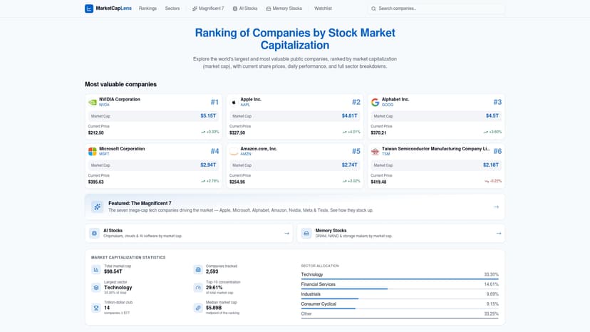
MarketCapLens tracks historical performance across more than 2,500 public companies, giving you the CAGR-style asset-level figures to benchmark against, whether that’s a single stock, a sector, or the AI stocks reshaping current market-cap rankings. This isn’t a substitute for computing your own XIRR. It’s the reference point you need before you do. Pull up a company’s historical returns on MarketCapLens, then run your own contribution dates through XIRR to see how your personal timing compared to simply holding the asset the whole way through.
Sources
- CAGR (compound annual growth rate) — Wall Street Prep
- Internal rate of return (IRR) — Wall Street Oasis
FAQ
Is a CAGR of 30% Good?
A 30% CAGR indicates very strong growth for a multi-year period, typically higher than average stock market returns, but a high CAGR over a shorter period may reflect a temporary rally rather than long-term performance.
What Does a 20% IRR Over Five Years Mean?
It means the investment’s cash flows, discounted at 20% annually, net out to zero, assuming any interim cash returns are reinvested at that rate. This is a strong result, though the reinvestment assumption should be considered, especially for longer holding periods.
What Is the Difference Between ARR and CAGR?
ARR (annual recurring revenue) measures a company’s predictable yearly revenue from subscriptions, while CAGR measures the compounded growth rate of any value, including ARR itself, between two points in time.
What Does a 10% CAGR Mean?
A 10% CAGR means an investment’s value grew as if it compounded at exactly 10% every year, even if the real year-to-year path was uneven, since CAGR smooths actual volatility into one average annual figure.
Recommended
For informational purposes only and is not investment advice. Do not rely on the facts, figures, ticker symbols, or other statements in this article — they may be incomplete, outdated, or incorrect, and we are not responsible for errors. See our disclaimer.