Blog
Watch VIX 30 and 20% MDD: Drawdown vs Volatility for Investors
By MarketCapLens · Published · 9 min read

Volatility measures price chop; drawdown measures cumulative loss. Track both, but use them for different jobs. Volatility tells you how bumpy the ride has been over the past days or weeks, useful for short-term trading and rebalancing decisions. Drawdown tells you how much money you actually lost from a prior peak, which is what determines whether your retirement plan survives. The sections below cover how to measure each one and where they disagree.
TL;DR:
- Volatility measures the size of price swings without indicating whether gains or losses occurred, making it less useful for assessing actual capital risk.
- A stock can show high volatility during a flat period but cause minimal drawdown if it does not decline substantially from its peak.
- Higher volatility increases the likelihood of deep drawdowns, but market shocks can produce greater losses than volatility models predict, especially during regime shifts.
- Monitoring a combination of realized volatility, implied volatility, maximum drawdown, and drawdown duration offers a more comprehensive risk picture than relying on volatility alone.
- Building separate dashboards for volatility and drawdown enhances risk awareness, with volatility tracking short-term turbulence and drawdown measuring actual capital loss.
MarketcaplensTrack Volatility And Drawdown TogetherMarketCapLens brings together real-time prices, historical data, and sector breakdowns to help you examine market trends and performance metrics.Explore market data
Table of Contents
- Volatility vs. Drawdown: What Volatility Actually Measures
- How Do You Calculate Volatility?
- What Is Drawdown and Why Does It Matter More to Your Wallet?
- How Do You Calculate Maximum Drawdown Step by Step?
- When Volatility and Drawdown Tell Different Stories
- Does Higher Volatility Always Mean Deeper Drawdowns?
- What Thresholds Should You Actually Watch?
- What Historical Examples Show About These Two Metrics
- Building a Risk Dashboard With MarketCapLens Data
- Why We Track Volatility and Drawdown on Separate Dashboards
- Track Both Metrics With Real Market Data
- Sources
- FAQ
Volatility vs. Drawdown: What Volatility Actually Measures
Volatility is the standard deviation of returns. It quantifies how far prices swing around their average, without caring whether those swings go up or down.
That symmetry matters. A stock that rockets significantly and one that crashes by a similar amount register identical volatility scores, even though one made you rich and the other wrecked your portfolio. This direction-agnostic design) is precisely why volatility alone can’t tell you whether you’re losing money.
Three flavors show up in practice:
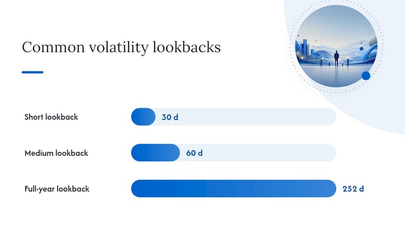
- Historical volatility: standard deviation calculated from past price data, usually over 30, 60, or 252 trading days.
- Realized volatility: a more granular ex-post measure built from high-frequency intraday returns.
- Implied volatility: derived from options prices, reflecting what the market expects going forward rather than what already happened.
Each answers a different question, and mixing them up leads to bad conclusions about risk.
How Do You Calculate Volatility?
Standard deviation is the workhorse. Here’s the basic process:
- Collect daily returns over your chosen window (30, 60, or 252 trading days are common lookbacks).
- Calculate the standard deviation of those daily returns.
- Annualize it by multiplying by the square root of the number of trading days in a year.
That gives you historical volatility. For something more responsive to recent shocks, exponentially weighted moving average (EWMA) and GARCH models weight recent returns more heavily than old ones, which helps capture volatility clustering, the tendency for calm periods and turbulent periods to persist. Realized volatility, built from intraday data, tends to be the most responsive measure of what actually happened, while implied volatility, captured by the VIX, prices in what the options market expects over the next 30 days.
Statistic to know: implied volatility typically trades above realized volatility, a gap known as the volatility risk premium, because option sellers demand compensation for uncertainty.
What Is Drawdown and Why Does It Matter More to Your Wallet?
Drawdown is the percentage decline from a portfolio’s highest point to its lowest point before a new high is reached. If your account peaks at $100,000 and later bottoms at $70,000, you’re carrying a 30% drawdown, full stop, regardless of how choppy or smooth the path down was.
Two versions matter for tracking:
- Instantaneous drawdown: how far below the peak you sit right now.
- Maximum drawdown (MDD): the worst peak-to-trough decline over the entire measurement period, the number most fund reports lead with.
Drawdown duration, how long it takes to recover, often matters more than the depth of the drop. Two portfolios with an identical 30% maximum drawdown can produce wildly different investor outcomes if one recovers in eight months and the other takes five years, especially for anyone taking withdrawals along the way.
How Do You Calculate Maximum Drawdown Step by Step?
The formula is simple: Drawdown % = (Trough Value − Peak Value) / Peak Value.
- Track the running peak (the highest value reached so far) at every point in your price series.
- At each new data point, subtract the current value from the running peak and divide by the peak.
- The most negative number in that series is your maximum drawdown.
- Mark the recovery date as the first day the portfolio closes above the prior peak. Duration is simply the number of days between the peak and that recovery.
Here’s a simplified five-day example:
Real portfolios use daily closing prices over months or years, and gaps in data (holidays, missing feeds) can distort the trough if you’re not careful about which values you interpolate.
When Volatility and Drawdown Tell Different Stories
Volatility treats a sharp rally and a sharp selloff as equally “risky.” Drawdown only cares about the selloff. That single distinction explains most of the confusion investors have when the two metrics diverge.
The deeper difference is path dependence. Volatility is essentially path-independent. It doesn’t care about the order of returns, only their dispersion. Drawdown is entirely path-dependent, since it depends on exactly when the peak occurred and exactly how the decline unfolded.
Two scenarios illustrate the split:
- A stock that grinds down 1% a day for 40 straight days shows low volatility (the moves are small and consistent) but produces a brutal 33% drawdown.
- A stock that whips up and down 5% daily but ends the month flat shows high volatility with a near-zero drawdown.
Pro Tip: If a position feels calm on a volatility chart but your account value keeps drifting lower, check the drawdown number before you relax. Slow bleeds rarely trip volatility alarms.
Does Higher Volatility Always Mean Deeper Drawdowns?
Higher volatility raises the statistical odds of a large drawdown, but it doesn’t fix the magnitude or timing of one. That distinction trips up a lot of model-driven risk frameworks.
Under simplified, stylized assumptions, drawdown can behave as a near-deterministic function of volatility. Real markets rarely cooperate: fat tails, heteroskedasticity, and sudden liquidity shocks break the clean relationship that theoretical models rely on.
That gap is why the academic modeling of drawdown as a volatility function works better in textbooks than in live portfolios. Regime shifts, like the flash liquidity vacuum of March 2020, can produce drawdowns far worse than a volatility-only model would predict, because volatility estimated from calm periods badly understates tail risk once markets seize up. Risk managers who rely solely on standard deviation, without running separate drawdown stress tests, tend to get blindsided exactly when it counts most.
What Thresholds Should You Actually Watch?
A monitoring routine doesn’t need to be complicated. Track a handful of numbers consistently and react only when they cross meaningful lines.
- Rolling realized volatility (30 and 60 day) to catch short-term turbulence.
- Implied volatility (VIX level) as a forward-looking sentiment and hedging-cost gauge.
- Running peak and current drawdown updated daily.
- Drawdown duration since the last peak, not just the depth.
A VIX reading above roughly 30 is commonly treated as elevated and worth a hedging review, while many investors treat a 20% or larger maximum drawdown as a breach of risk tolerance that justifies rebalancing. Short volatility spikes with no drawdown follow-through are usually noise worth ignoring.
Pro Tip: A rising VIX with no drawdown yet is a warning to check your hedges before the selloff, not after.
What Historical Examples Show About These Two Metrics
Three periods make the distinction concrete, and each one produced a different combination of volatility behavior and drawdown pain.
| Period | Volatility Behavior | Drawdown Behavior | Investor Takeaway |
|---|---|---|---|
| 2008 financial crisis | Sustained, extreme spike | Deep, prolonged (over a year to bottom) | Both metrics screamed danger together |
| March 2020 crash | Historic spike, very short-lived | Fast, steep drop, unusually quick recovery | Drawdown resolved faster than the volatility spike suggested |
| 2018 to 2019 | Sharp, repeated volatility spikes | No lasting drawdown | Volatility alarms without capital damage |
The 2018 to 2019 stretch is the one investors most often misread, mistaking short volatility spikes for real portfolio damage. Diversifying into assets that behave differently under stress, including gold as a potential crash hedge, is one way some investors try to dampen drawdown specifically rather than just smoothing volatility.
Building a Risk Dashboard With MarketCapLens Data
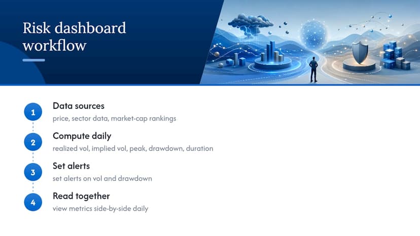
A practical dashboard tracks rolling realized volatility, implied volatility, running peak, current drawdown, and drawdown duration side by side. MarketCapLens’s real-time price and sector data can feed the peak-tracking and drawdown fields directly, while current market-cap rankings help you spot which holdings are driving the moves. Compute the metrics daily, set alert rules on both, and read them together, not separately.
Why We Track Volatility and Drawdown on Separate Dashboards
Most retail dashboards bolt drawdown onto a volatility chart as an afterthought. We think that’s backwards. Volatility answers “how bumpy is this,” which is a trading question. Drawdown answers “how much did I actually lose,” which is a survival question, and conflating the two leads investors to either panic over noise or ignore a slow bleed that never trips a volatility alert.
Real-time data changes how useful this distinction is. A volatility spike you catch same-day is actionable; one you notice a week later after skimming a monthly statement is not. That’s the practical case for pairing both metrics with current pricing rather than a quarterly snapshot.
If you only remember one thing: watch volatility for the weather, watch drawdown for the wound.
— MarketCapLens
Track Both Metrics With Real Market Data
Building the dashboard described above starts with reliable inputs, and that’s exactly what MarketCapLens provides: real-time share prices, sector breakdowns, and daily performance metrics across more than 2,500 companies, the raw material for both your volatility and drawdown calculations.
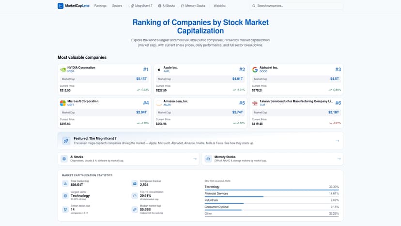
Instead of stitching together price feeds from multiple sources to compute your running peak and rolling standard deviation, pull current figures directly from market cap rankings updated multiple times a day. Want to understand what’s actually driving a holding’s price swings before you react to a volatility alert? Start with what changes a company’s market cap and build your monitoring routine from there.
Sources
The Chicago Fed working paper on realized volatility covers EWMA, GARCH, and high-frequency measurement methods in depth. Investopedia’s volatility explainer breaks down implied volatility and VIX mechanics. Pomegra’s drawdown vs. volatility chapter walks through the psychology of drawdown duration.
This article is general information, not a substitute for advice from a qualified financial advisor. Consult a qualified financial professional about your own circumstances before acting on anything here.
FAQ
What Does Warren Buffett Say About Volatility?
Buffett has long argued that volatility is not the same as risk, describing genuine risk as the permanent loss of capital rather than short-term price swings. That view lines up closely with why drawdown, not volatility, is the metric that best captures capital loss.
What Does a 5% Drawdown Mean?
A 5% drawdown means your portfolio or position has fallen 5% from its most recent peak value. It’s a minor, often routine dip that most diversified portfolios experience multiple times a year without signaling deeper trouble.
What Is a Good Drawdown in Trading?
There’s no universal number, but many traders and fund managers treat a maximum drawdown under 15 to 20% as manageable, while a drawdown beyond 20% commonly triggers a formal risk review or strategy reassessment.
What Is an ETF Drawdown?
An ETF drawdown is the percentage decline in an ETF’s price or net asset value from its most recent peak to its lowest subsequent point, calculated the same way as drawdown for any other security or portfolio.
Recommended
For informational purposes only and is not investment advice. Do not rely on the facts, figures, ticker symbols, or other statements in this article — they may be incomplete, outdated, or incorrect, and we are not responsible for errors. See our disclaimer.