Blog
Investors: Run the P/S Check to Compare Market Cap and Revenue
By MarketCapLens · Published · 11 min read

Market capitalization is what investors think a company is worth right now: share price multiplied by shares outstanding. Revenue is what the company actually sold, before a single expense gets subtracted. One is a valuation opinion. The other is a scorecard. A firm can post billions in sales and still carry a smaller market cap than a competitor with a fraction of that revenue, because the price-to-sales ratio connects the two and tells you how much investors are paying for each dollar of sales.
TL;DR:
- A high P/S ratio in software companies often indicates strong growth expectations, while lower ratios in manufacturing reflect cyclical risk or low margins.
- Market cap considers future earnings potential and share structure effects, whereas revenue indicates current operational size without profitability implications.
- Comparing sector medians and historical ranges is essential because industry norms heavily influence what constitutes a reasonable P/S ratio.
- A company with a market cap significantly higher than its revenue suggests investor optimism about future profit expansion, especially in high-growth sectors.
- Proper analysis requires matching revenue and share data from the same period and factoring in debt and share structure to avoid misleading conclusions.
MarketcaplensCompare Market Cap With RevenueMarketCapLens brings together real-time company data, historical trends, and sector breakdowns for clearer market cap and revenue research.Explore market data
Table of Contents
- Market Cap vs Revenue: The Core Definitions
- How Does the Price-to-Sales Ratio Connect Market Cap and Revenue?
- Why Do Market Cap and Revenue Tell Different Stories?
- When Should Investors Weigh Market Cap Over Revenue?
- Worked Examples: Market Cap and Revenue in Practice
- How Do You Calculate and Verify Market Cap vs. Revenue Comparisons?
- Where Does This Data Come From?
- Our Take: Use Both Numbers, Not Just One
- Check the Numbers Yourself, Not Just the Headline
- Sources
- FAQ
Market Cap vs Revenue: The Core Definitions
Start with the formulas, because half the confusion between these two metrics disappears once the math is on the table.
Market capitalization equals current share price multiplied by total shares outstanding. It is a snapshot of what the stock market currently values the entire company at, and it moves every time the share price moves, even if nothing about the business itself changed that day. Market cap is also the standard yardstick for classifying companies as large-, mid-, or small-cap, and analysts use it constantly for that purpose rather than as a measure of intrinsic worth.
Revenue, sometimes called the top line, is total income generated from sales before any costs, taxes, or expenses are deducted. Companies report it quarterly and annually, and analysts often prefer trailing twelve months (TTM) revenue, the sum of the most recent four quarters, because it smooths out seasonal swings better than a single fiscal year snapshot.
A related but distinct figure is enterprise value, which adds debt and preferred stock to market cap and subtracts cash. That distinction matters when you’re evaluating what it would actually cost to acquire a company outright, since enterprise value accounts for the debt an acquirer would inherit in a way market cap alone never does.
Here’s the shorthand version worth keeping in your notes:
- Market cap = share price × shares outstanding. It answers “what does the market say this company is worth?”
- Revenue = total sales over a defined period. It answers “how much business is this company actually doing?”
- Shares outstanding differs from float (shares actually available for public trading), which affects how liquid a stock really is.
- Neither number, alone, tells you whether a stock is cheap, expensive, or a good buy.
One common trap: mistaking a high share price for a large company. A $400 stock with 10 million shares outstanding is worth far less than a $40 stock with 500 million shares. Market cap corrects for that; share price by itself does not.
How Does the Price-to-Sales Ratio Connect Market Cap and Revenue?
The price-to-sales ratio, or P/S, is the bridge between these two numbers. You calculate it by dividing market capitalization by total revenue, typically using TTM revenue rather than a single fiscal year, since it captures the most current sales trend without the distortion of one unusually strong or weak quarter.
The math works like this:
- Pull the company’s current market cap.
- Pull TTM revenue from the last four reported quarters.
- Divide market cap by TTM revenue to get the P/S ratio.
- Compare that ratio against the company’s own historical range and against sector peers, not against some universal benchmark.
P/S earns its keep in situations where price-to-earnings ratios fall apart. A young software company can burn cash for years while still growing revenue fast, and P/S becomes one of the few multiples that stays usable when earnings are negative or wildly volatile. Its weakness is the flip side of that strength: P/S says nothing about margins, so it can make a low-margin retailer and a high-margin software firm look deceptively similar on paper.
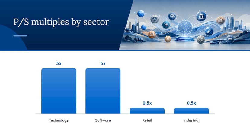
A P/S of 5x means investors are paying $5 for every $1 of annual revenue. A P/S of 0.5x means they’re paying just 50 cents per dollar of sales, often a signal of a low-margin business, a cyclical downturn, or a market that’s pricing in trouble ahead. Neither number is automatically good or bad. Technology and software companies routinely trade at P/S multiples several times higher than retailers or industrial manufacturers, because investors are pricing in margin expansion and growth that hasn’t shown up in the income statement yet.
Why Do Market Cap and Revenue Tell Different Stories?
Market cap and revenue diverge because they’re answering fundamentally different questions, and the gap between them usually comes down to five forces.
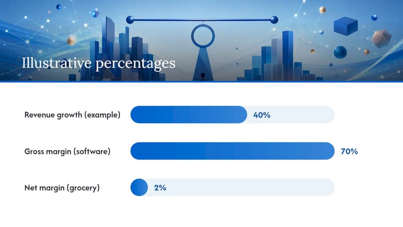
Growth expectations drive the biggest wedge. A stock price reflects discounted future cash flows, meaning investors are pricing in sales and profits that haven’t happened yet. A company growing revenue 40% a year can justify a market cap many multiples larger than a slow-growing peer with identical current-year sales.
Profitability and margins matter just as much. A dollar of revenue from a software company with 70% gross margins is worth more to investors than a dollar of revenue from a grocery chain running on 2% net margins. Revenue alone can’t distinguish between the two.
Capital structure changes the comparison entirely. Two companies with identical market caps can carry very different debt loads, and enterprise value captures that difference in a way market cap alone cannot.
Share count effects also move market cap independent of the business itself:
- Buybacks reduce shares outstanding, which can lift market cap per share even with flat revenue.
- New share issuance dilutes existing holders and can suppress market cap growth even as revenue climbs.
- Dual-class share structures complicate the picture further, since founders often hold shares with outsized voting power that don’t trade at the same price as public shares.
Sentiment and macro conditions round out the list. Interest rate shifts alone can compress or expand valuation multiples across an entire sector, moving market cap dramatically while revenue barely budges quarter to quarter.
Pro Tip: Before assuming a stock is “overvalued” because its market cap dwarfs its revenue, check whether the company operates in a sector where investors typically pay a premium for growth. A 10x P/S ratio means something completely different in cloud software than it does in commodity chemicals.
When Should Investors Weigh Market Cap Over Revenue?
Which metric deserves more weight depends heavily on where a company sits in its life cycle. Early-stage and high-growth companies are usually judged on revenue growth rate and P/S, because profits are years away and earnings multiples don’t apply yet. Mature, cash-generating companies get judged more on earnings multiples, free cash flow, and dividend coverage, where revenue is just the starting input rather than the main event.
Industry context changes the benchmark entirely. A software company at a 6x P/S might be trading at a discount to its peer group, while an industrial distributor at the same 6x P/S would look wildly expensive, since that sector typically trades closer to 1x or 2x sales. That’s why the Investopedia comparison of market cap and revenue stresses benchmarking against sector medians and historical ranges rather than chasing an absolute “good” number.
Volatility also scales with cap tier. Small-cap stocks swing harder on both price and revenue surprises than large-caps, so a divergence between market cap and revenue in a small-cap name deserves more scrutiny than the same gap in a mega-cap with a decades-long track record.
Run through this checklist whenever market cap and revenue seem to be telling contradictory stories:
- Is TTM revenue growing, flat, or shrinking, and how does that compare to the sector average?
- What’s the company’s P/S relative to its own five-year range?
- Does the balance sheet carry meaningful debt that market cap doesn’t reflect?
- Have shares outstanding grown or shrunk significantly in the past year?
- Is the sector currently trading at elevated or depressed multiples industry-wide?
Worked Examples: Market Cap and Revenue in Practice
Numbers make this concrete faster than theory does. Consider two hypothetical companies, both operating in real sectors where these patterns show up repeatedly.
High-growth software category: A cloud software company posts $2 billion in TTM revenue but carries a $20 billion market cap. The market cap reflects a bet on 2029’s income statement, not 2026’s.
Industrial manufacturing category: A heavy-equipment manufacturer posts $18 billion in TTM revenue but carries a market cap of just $9 billion. Revenue dwarfs the software example by nine times, yet the market cap is smaller, because margins run thin, growth is low single digits, and the business is capital-intensive with heavy debt service. Investors are pricing in cyclicality and modest earnings, not the top-line number.
- Same relationship, opposite conclusion. High P/S signals growth optimism; low P/S signals margin or cyclicality concerns.
- Revenue tells you the size of the operation. Market cap tells you what investors think that operation is worth going forward.
- Neither example is “wrong.” They’re pricing fundamentally different business models.
How Do You Calculate and Verify Market Cap vs. Revenue Comparisons?
Getting this comparison right takes a handful of careful steps, and skipping any one of them is where most errors creep in.
- Confirm current share price and total shares outstanding (not float) before calculating market cap.
- Pull TTM revenue from the four most recent quarterly filings, not a stale annual figure.
- Divide market cap by TTM revenue to get P/S, then compare it to the sector median.
- Check whether the company has multiple share classes, which can distort per-share calculations if you’re not summing all classes.
- Cross-check your numbers against a second source before drawing conclusions.
The most common mistakes: mixing a quarterly revenue figure with an annualized market cap, using float instead of total shares outstanding, and ignoring debt entirely when the real question is acquisition cost rather than public trading value.
Pro Tip: Pull your share count and revenue figures from the same reporting date whenever possible. A three-month mismatch between when you grabbed the share price and when the revenue figure was filed can throw your P/S off by a meaningful margin, especially for volatile stocks.
Where Does This Data Come From?
MarketCapLens tracks real-time market-cap data across more than 2,500 public companies, alongside sector breakdowns and historical trend charts that let you see whether today’s P/S ratio is high or low relative to a company’s own past.
For readers who want to go deeper on the mechanics, the plain-English guide to market capitalization and the breakdown of shares outstanding versus float cover the calculation details this article only has room to summarize.
Our Take: Use Both Numbers, Not Just One
Neither metric wins outright. Revenue tells you the size of the operation today; market cap tells you what the market is betting on tomorrow. The useful move isn’t picking a side, it’s computing the P/S ratio and checking it against the sector median before drawing any conclusion. Start there, using a public filing or MarketCapLens, and the rest of the analysis gets a lot easier.
— MarketCapLens
Check the Numbers Yourself, Not Just the Headline
Most investing explainers stop at definitions. If you actually want to run the P/S check from this article on a real company, that’s a data problem, not a theory problem, and that’s exactly what MarketCapLens was built for.
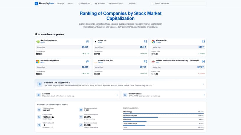
The platform tracks live market-cap figures and sector breakdowns across many public companies, so you can pull a current market cap, cross-reference it against TTM revenue, and see where a stock’s P/S sits relative to its own history without stitching numbers together from multiple filings. Want to see how a specific name stacks up? Check live figures for companies like Apple, Meta, or Oracle, or browse sector rankings to find the peer group median before you judge any single company’s multiple. If you’re still getting comfortable with the fundamentals, the market capitalization primer is the fastest way to get there. Start with the market cap rankings page and run the comparison on a company you already follow.
Sources
- Price–sales ratio — Wikipedia
- Market Capitalization: What It Means for Investors — Investopedia
- Market cap explained — FINRA
This article is general information, not a substitute for advice from a qualified financial advisor. Consult a qualified financial professional about your own circumstances before acting on anything here.
FAQ
What Is a Good Market Cap to Revenue Ratio?
There’s no universal “good” P/S ratio. A reasonable P/S depends heavily on the sector, where software companies often trade at multiples several times higher than retailers, so the right benchmark is the sector median and the company’s own historical range.
What Does It Mean if Revenue Is Higher Than Market Cap?
It usually signals the market expects weak margins, slow growth, heavy debt, or cyclical risk ahead, common in capital-intensive industries like manufacturing or commodities where sales volume doesn’t translate into strong profit.
Is Revenue or Market Cap More Important for Investors?
Neither is inherently more important. FINRA notes both metrics play complementary roles: revenue shows operational scale, while market cap reflects investor expectations about future performance.
What Is the Relationship Between Market Cap and Revenue?
The price-to-sales ratio links them directly by dividing market cap by revenue, showing how much investors are paying for each dollar of sales a company generates.
Recommended
For informational purposes only and is not investment advice. Do not rely on the facts, figures, ticker symbols, or other statements in this article — they may be incomplete, outdated, or incorrect, and we are not responsible for errors. See our disclaimer.