Blog
1–2 Hour Top Down Sector Analysis Using Public Data and a Sector Tool
By MarketCapLens · Published · 17 min read

Top-down sector analysis starts with macroeconomic signals like GDP, interest rates, and inflation to identify which sectors are positioned to outperform, then narrows to individual stocks inside those sectors. It works best when the economic cycle is shifting, not when markets are calm and directionless. Follow this framework and you’ll end up with a shortlist of sectors worth your research time, not fifty tickers you picked because they sounded interesting.
TL;DR:
- Top-down sector analysis relies heavily on macroeconomic signals, especially yield curve inversions and PMI declines, to predict upcoming sector rotations.
- Sector shifts tend to occur quickly during cycle transitions, requiring timely interpretation of indicators like GDP growth, inflation, and unemployment.
- Combining macro data with sector-level earnings revisions and capital expenditure trends improves the accuracy of sector tilts, especially when confirmed by multiple signals.
- Stock selection within favored sectors should focus on valuation, momentum, balance sheet strength, and management track record to avoid costly errors.
- This analysis framework can be executed in one to two hours using free public sources and sector ranking tools, but it requires disciplined monitoring of macro shifts to avoid overreacting.
MarketcaplensTrack Sector Trends With Current DataMarketCapLens brings together share prices, sector breakdowns, historic data, and market trends across more than 2,500 public companies.Explore MarketCapLens
Table of Contents
- What Is Top-Down Sector Analysis and How Does It Work?
- Which Macroeconomic Indicators Drive Sector Views?
- How Do You Turn a Macro View Into a Sector Tilt?
- How Do You Pick Stocks Inside a Favored Sector?
- How Do You Combine Top-Down and Bottom-Up Analysis?
- Where Do You Find the Data to Run This Analysis?
- The 1 to 2 Hour Top-Down Checklist You Can Run This Weekend
- Where Top-Down Analysis Goes Wrong
- Does Top-Down Sector Analysis Actually Work? What History Shows
- How Do Sectors Move Together (or Apart) Across the Cycle?
- What Quantitative Tools Improve a Top-Down Model?
- Why Top-Down Sector Analysis Has Limits in Modern Markets
- How Does Sector Analysis Improve Portfolio Diversification?
- How I Think About Applying This Framework in Practice
- Run Your Sector Screen Faster With MarketCapLens
- Primary Sources for Further Reading
- Sources
- FAQ
What Is Top-Down Sector Analysis and How Does It Work?
The process runs in one direction: macro first, sector second, stock last. You start by reading the broad economy, decide which industries that environment favors, then hunt for the best companies inside those industries. Corporate Finance Institute describes this as a hierarchical flow that moves from global macro conditions to sector allocation and only then to company-level fundamentals.
The macro read acts as a filter before it acts as a forecast. If manufacturing data is weakening and the yield curve is flattening, you don’t need forty hours of research to know that heavily cyclical industrials probably deserve less of your attention right now than defensive utilities or health care. That filter is the entire point: it tells you where to spend your limited research hours instead of spreading them evenly across eleven sectors that don’t deserve equal attention in every part of the cycle.
Each stage does a distinct job:
- Macro assessment sets the regime: expansion, slowdown, contraction, or recovery.
- Sector analysis maps that regime to industries with tailwinds or headwinds.
- Stock selection finds the specific companies inside the favored sectors that also pass a fundamental checkup.
Skip the first step and you’re just picking stocks by story. Skip the last step and you own an index fund with extra risk. The method only works when all three stages get done, in order, without shortcuts.
Which Macroeconomic Indicators Drive Sector Views?
Eight data points do most of the heavy lifting in a top-down read, and each one points toward different sectors depending on which direction it’s moving.
- GDP growth rate. Accelerating GDP tends to favor cyclicals like industrials and consumer discretionary; decelerating GDP favors staples and utilities. The Bureau of Economic Analysis publishes quarterly advance, second, and third estimates.
- Fed funds rate and rate expectations. Rising rates squeeze rate-sensitive sectors like real estate and utilities while often helping bank net interest margins.
- Treasury yield curve. An inverted curve (short rates above long rates) has historically preceded recessions and tends to hurt cyclicals ahead of the actual downturn.
- CPI and PCE inflation. Persistent inflation pressures margins for companies without pricing power; it can help energy and materials producers.
- ISM/PMI manufacturing and services indexes. A reading below 50 signals contraction in that part of the economy.
- Unemployment rate and payrolls. Rising unemployment usually precedes weaker consumer discretionary spending.
- Commodity prices. Oil and industrial metals often lead sector rotations into or out of energy and materials.
- Dollar index. A strengthening dollar tends to pressure multinational earnings and commodity exporters.
Fast fact: Treasury yield-curve inversions and sub-50 PMI readings are two of the most watched top-down signals for calling a cycle turn before earnings confirm it.
Find GDP and trade data at bea.gov, inflation and employment data at Bls, and rate policy plus the yield curve directly from the Federal Reserve and Treasury sites. None of these require a subscription.
How Do You Turn a Macro View Into a Sector Tilt?
Reading the data is only half the job. The harder skill is translating “PMI fell to 48” into “reduce industrials, add staples.” A few mapping rules make that translation less subjective.
- Early expansion: financials and industrials tend to lead as credit growth accelerates and order backlogs build.
- Mid-cycle: technology and consumer discretionary often carry the baton as earnings momentum broadens.
- Late-cycle: energy and materials frequently outperform as capacity gets tight and input costs rise.
- Recession/contraction: utilities, health care, and consumer staples typically hold up best on defensive demand.
These aren’t fixed laws. Sector correlations shift, and every cycle carries its own quirks. But the pattern holds often enough that it’s a starting hypothesis, not a rule you follow blindly.
Beyond the four broad regimes, watch two sector-level tells that confirm or contradict what the macro data implies. Earnings revisions matter: if analysts are raising estimates across a sector while the broad market’s estimates are flat, that sector is showing relative strength the macro backdrop alone won’t reveal. Capex announcements matter too. A wave of capital spending commitments in a given industry often precedes a multi-quarter run of sector outperformance, because it signals management teams betting real money on demand.
Say the ISM manufacturing index has dropped for three straight months and the yield curve just inverted. That combination historically points toward trimming cyclical industrials and adding to health care and staples, the two sectors that see the smallest earnings swings when GDP slows. It’s a hypothesis to test against sector-level data, not an automatic trade. If you want a more detailed framework for rotating between sectors as the cycle turns, a full sector rotation strategy walks through the mechanics month by month.
How Do You Pick Stocks Inside a Favored Sector?
Once you’ve narrowed the field to two or three sectors, the bottom-up work begins. This is where top-down analysis stops being a macro exercise and starts being stock-picking, just with a much smaller universe to cover.
- Valuation relative to sector peers and historical multiples, not just the market as a whole.
- Price momentum and whether institutional money is already flowing into the name.
- Balance sheet strength, especially debt maturities if rates are rising.
- Return on invested capital (ROIC) compared to sector averages.
- Management track record on capital allocation through prior cycles.
Different sectors demand different diagnostic questions. A SaaS company lives or dies on net revenue retention and churn; a bank lives or dies on credit quality and funding costs; an energy producer lives or dies on reserve replacement and breakeven cost per barrel. Applying a generic checklist to every sector is one of the more common mistakes analysts make once they’ve done the hard macro work correctly.
Position size should track your conviction, not just how much you like the story. A high-conviction call backed by strong macro, sector, and stock signals might justify 4% to 6% of a portfolio; a speculative or contrarian call belongs closer to 1% to 2%, based on a rubric Trustybull outlines for scaling exposure to conviction. Macro-sensitive stocks, meanwhile, deserve smaller individual positions than defensive ones even at equal conviction, simply because they carry more variance.
Pro Tip: Before buying anything inside a “hot” sector, check whether the stock’s price has already moved on the macro story. A great sector call executed six months late just means you’re paying a premium for a thesis everyone else already priced in.
How Do You Combine Top-Down and Bottom-Up Analysis?
Neither approach works well alone. Investopedia frames the two as complementary: macro sets the guardrails, bottom-up analysis supplies the precision inside those guardrails. A workable cadence looks like this:
- Monthly: review the core macro dashboard (GDP trend, rate path, PMI, unemployment, yield curve) and check whether your sector tilts still match the data.
- Quarterly: revisit sector-level earnings revisions and capex trends, and rebalance sector weights if the regime has shifted.
- Ongoing: route deep fundamental research toward the two or three sectors your macro screen flags, rather than spreading it evenly.
Set risk controls before you need them. A common approach caps any single sector at a fixed band, say 15% to 20% of equity exposure, regardless of how strong the thesis looks. Define specific triggers that force a reassessment: a PMI print below 45, a yield-curve re-inversion, or two consecutive quarters of negative earnings revisions in a sector you’re overweight. Treat macro as a risk framework rather than a trigger for frequent trading; chasing every data print into a new rotation usually costs more in transaction friction than it earns in timing accuracy.
Where Do You Find the Data to Run This Analysis?
You don’t need a Bloomberg terminal to run a competent top-down screen. A handful of free, authoritative sources cover almost everything.
- BEA.gov for GDP releases, trade data, and personal consumption expenditures.
- BLS.gov for CPI, PPI, unemployment, and payroll reports.
- The Federal Reserve for rate decisions, FOMC statements, and the Treasury yield curve.
- ISM for manufacturing and services PMI readings released the first business day of each month.
- MarketCapLens for sector rankings, historical sector performance, and quick screens across more than 2,500 companies by market cap.
Fast fact: Combining a free macro dashboard with a sector-ranking tool turns a multi-day research project into something you can run in an afternoon.
A short walkthrough: suppose PMI has fallen for two straight months and the yield curve just flattened toward inversion. Pull sector rankings by market cap to see which sectors are already showing relative price weakness, cross-reference against the defensive-sector hypothesis from the macro read, then export the top companies by market cap in health care and staples for the deeper bottom-up pass described above.
The 1 to 2 Hour Top-Down Checklist You Can Run This Weekend
You don’t need a research team to do this properly. Here’s a compressed version built for a single sitting.
- Minutes 0 to 20: Pull the latest GDP trend, CPI print, unemployment rate, and PMI reading. Note whether each is accelerating, flat, or decelerating.
- Minutes 20 to 35: Check the yield curve shape and Fed rate path. Assign a macro conviction score from 1 (bearish/contracting) to 5 (bullish/expanding).
- Minutes 35 to 60: Map the macro score to two or three sectors using the cycle-phase rules above. Score each sector’s momentum from 1 to 5 based on earnings revisions and relative price strength.
- Minutes 60 to 90: Shortlist five to eight stocks inside those sectors and score each on valuation, balance sheet, and ROIC.
- Minutes 90 to 120: Multiply your conviction scores into a position-size range and set your reassessment triggers.
| Score range (macro + sector + stock, out of 15) | Suggested position size | Conviction level |
|---|---|---|
| 15 | 4% to 6% of equity allocation | High conviction |
| 8 | 2% to 3% | Moderate conviction |
| 5 to 7 | 1% to 2% | Low conviction / watch list |
Where Top-Down Analysis Goes Wrong
The most common failure is misreading which stage of the cycle you’re actually in. Yield curves invert and un-invert; PMI dips and recovers without turning into a recession. Analysts who treat one weak data print as a confirmed regime shift end up rotating out of cyclicals just before those sectors turn around, and rotating back in after most of the recovery already happened.
The second failure is more subtle: getting the macro and sector call right, then buying the wrong stock inside the right sector. A sector tailwind lifts the average company, but it doesn’t rescue a business with a broken balance sheet or a management team that’s been destroying capital for years. Overreliance on top-down signals can cause analysts to skip company-specific diligence entirely, assuming the sector thesis alone justifies the position.
A third, quieter failure mode is timing lag. Macro data gets released weeks after the fact, revised twice more after that, and priced into markets well before most retail investors ever see the print. By the time GDP confirms a slowdown, sector rotation driven by that slowdown may already be half finished. This is why forward-looking indicators like PMI and the yield curve get more weight than backward-looking ones like GDP in most top-down frameworks.
Finally, there’s the trap of overtrading a framework built for patience. Rebalancing sector weights every time a data print surprises to the upside or downside turns a disciplined process into a whipsaw machine, racking up transaction costs and tax drag without improving returns.
Does Top-Down Sector Analysis Actually Work? What History Shows
The clearest historical example is the shift into energy and materials during the inflationary stretch of the early 2000s commodity cycle, when rising GDP in emerging markets combined with a weakening dollar to push oil and industrial metals sharply higher. Investors who read those macro signals early rotated into energy well before the broader market caught on.
The 2008 financial crisis offers the opposite lesson. The yield curve had inverted in 2006, nearly two years before the worst of the crash, and financials began underperforming long before Lehman Brothers collapsed. Investors running a disciplined top-down process had a long runway to reduce financial-sector exposure. Those relying purely on bottom-up stock picking, evaluating bank balance sheets one at a time without the macro overlay, often missed the systemic risk building underneath individual “cheap” valuations.
The 2020 pandemic recovery is a case study in speed rather than duration. Technology and consumer discretionary sectors, especially anything tied to remote work and e-commerce, saw earnings and price momentum accelerate within a single quarter as macro conditions shifted almost overnight. That compressed timeline is a reminder that top-down signals don’t always give you months of warning. Sometimes the regime shifts in weeks, and the analysts moving fastest on the data capture most of the gain.
None of these examples prove the framework is infallible. They show that when macro regime changes are large and sector effects are strong, which tends to happen most clearly during cycle transitions, the payoff for reading the data early is real.
How Do Sectors Move Together (or Apart) Across the Cycle?
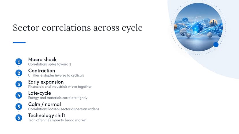
Sector correlations aren’t fixed. They stretch and compress depending on what’s driving the broader market at any given moment. During a sharp macro shock, like a rate surprise or a credit event, correlations across almost all sectors tend to spike toward 1, meaning nearly everything sells off together regardless of individual fundamentals. That’s the environment where sector selection matters least, because systemic risk overwhelms sector-specific drivers.
During calmer stretches of an economic cycle, correlations loosen and sector-specific factors reassert themselves. Energy starts trading more on oil prices than on the S&P 500’s daily move; regional banks start trading more on local credit conditions than on tech-sector headlines. This is when top-down sector selection earns its keep, because the dispersion between sector returns widens enough to matter.
A few relationships are worth watching specifically. Financials and industrials tend to move together in early expansion, both benefiting from credit growth and rising order books. Energy and materials often correlate tightly in late-cycle environments as input-cost inflation lifts both simultaneously. Utilities and consumer staples, the two classic defensive sectors, tend to move inversely to cyclicals during contractions, which is exactly the diversification benefit that makes them useful portfolio ballast rather than growth drivers.
Technology occupies an unusual middle ground. It behaved like a classic cyclical growth sector for much of the past two decades, but its heavy weighting in major indexes now means its correlation with the broad market itself is often higher than its correlation with the traditional cyclical basket. That shift matters for anyone building sector weights off historical correlation tables, since a relationship that held for ten years can quietly break.
What Quantitative Tools Improve a Top-Down Model?
Weighting schemes turn a qualitative macro read into something closer to a repeatable score. A basic version assigns numeric weights to each indicator (GDP, PMI, yield curve, unemployment, inflation) based on how reliably each has predicted sector rotation historically, then sums them into a single composite macro score. That score becomes the input for the conviction-based position-sizing table covered earlier.
More sophisticated versions build a diffusion index, tracking the percentage of tracked indicators that are improving versus deteriorating in a given month, similar in spirit to how PMI itself is constructed from a basket of underlying components. A diffusion index above 50 suggests broadening strength; below 50 suggests broadening weakness, even before any single headline number confirms it.
Some analysts layer in a factor-based screen on top of the macro score, ranking sectors by relative earnings revision momentum, relative price strength versus the broad index, and relative valuation compression or expansion. Combining a macro composite score with a sector-level factor screen reduces the risk of acting on a single noisy data print, since a genuine regime shift usually shows up across multiple signals at once rather than in isolation.
None of this requires custom software. A spreadsheet tracking eight to ten indicators monthly, each assigned a simple 1 to 5 score, gets you most of the benefit institutional quant desks chase with far more complex models.
Why Top-Down Sector Analysis Has Limits in Modern Markets
Markets have gotten faster and more interconnected, and that has genuinely dulled some of the edge top-down analysis once offered. Macro data is now priced almost instantly by algorithmic trading desks that react to a CPI print in milliseconds, long before a retail investor has finished reading the headline number. The lag between “data releases” and “market already moved” has compressed sharply over the past two decades.
Globalization has also blurred sector boundaries that used to be cleaner. A “technology” company today might carry meaningful exposure to advertising cycles, semiconductor supply chains, and consumer discretionary spending all at once, which makes a single macro-to-sector mapping less precise than it was when sector definitions tracked more distinct business models.
Passive investing adds another wrinkle. When index funds and sector ETFs dominate trading volume, individual stocks inside a sector can move together on flow dynamics rather than fundamentals, which muddies the signal a top-down analyst is trying to read from price action alone.
None of this makes the framework obsolete. It means the framework works better as one input among several rather than a standalone trading system, and it rewards analysts who move on genuine regime shifts rather than daily noise.
How Does Sector Analysis Improve Portfolio Diversification?
The diversification case for top-down sector work isn’t about picking winners. It’s about understanding which sectors will actually offset each other when conditions turn, rather than assuming any basket of eleven sector labels automatically spreads your risk.
Top-down sector analysis is the alternative for investors willing to actively tilt away from that static split when the macro backdrop clearly favors or disfavors specific industries.
A portfolio built purely on market-cap weighting can end up more concentrated in a handful of dominant sectors than an investor realizes, simply because a few mega-cap technology names carry outsized index weight. Running a periodic top-down sector review surfaces that concentration risk and gives you a reason to actively rebalance toward underweighted, currently favored sectors rather than letting index drift set your allocation by default.
How I Think About Applying This Framework in Practice
The biggest trade-off in top-down sector work is speed versus confirmation. Act the moment one indicator turns and you’ll catch every real regime shift early, along with a handful of false signals that cost you in whipsaw trades. Wait for three or four indicators to confirm the same story and you’ll dodge most of the noise, but you’ll also be a step behind on the fastest-moving cycles.
The habit that actually prevents over-rotating on a weak signal is maintaining a running macro dashboard rather than checking indicators reactively. Reviewing the same eight to ten data points on a fixed monthly schedule, rather than only glancing at them after a scary headline, makes it far easier to tell a genuine trend from a single noisy data point. If you only check the yield curve after a market drop, you’ll always feel like it’s screaming at you. Check it every month and you’ll see it inch, not lurch.
— MarketCapLens
Run Your Sector Screen Faster With MarketCapLens
Once you’ve done the macro reading, the bottleneck shifts to data. Pulling sector-level price performance, historical returns, and market-cap rankings by hand across a dozen candidate companies eats the exact hour you just saved by narrowing your sector list. There are platforms that track sector allocations and daily performance across thousands of companies, so the sector-mapping step in your checklist can take minutes instead of an afternoon of spreadsheet building.
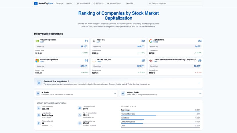
Start with the sector rankings page to see which industries are already showing relative strength or weakness, then narrow to specific names using market cap rankings to build your shortlist. If you’re still getting comfortable with how market capitalization drives sector weighting, the plain-English market cap guide is a fast primer before you start screening.
Primary Sources for Further Reading
Every indicator covered here traces back to a public source you can bookmark and check monthly.
- Bea for GDP and growth data.
- Bls for CPI, inflation, and employment reports.
- Sec for investor due-diligence guidance on companies and brokers.
- CFA Institute for professional frameworks behind rigorous investment analysis.
Sources
- Top-Down Analysis | Corporate Finance Institute
- Gross Domestic Product, 1st Quarter 2025 (Advance Estimate) | BEA
- Consumer Price Index (CPI) | BLS
- Top-Down vs Bottom-Up Sector Analysis Explained | Pomegra Learn Library
FAQ
What Is Top-Down vs. Bottom-Up Analysis?
Top-down starts with macro conditions and narrows to sectors and then stocks, while bottom-up starts with individual company fundamentals and builds up regardless of the broader economic picture. Most practitioners blend both.
What Are the Top Sectors to Watch Right Now?
There’s no fixed answer since sector leadership rotates with the cycle. Check current relative performance across sector rankings by market cap alongside the macro indicators covered above rather than relying on a static list.
What Is the 7% Rule in Stocks?
It’s a risk-management guideline, most associated with technical trading systems, suggesting investors sell a stock if it falls roughly 7% to 8% below the purchase price to limit downside. It’s a stock-level stop-loss rule, distinct from the sector and macro screening covered in this framework.
How Long Does a Top-Down Sector Analysis Take?
A focused version covering macro review, sector mapping, and an initial stock shortlist can be done in one to two hours using free public data plus a sector-ranking tool, following the checklist outlined above.
Recommended
For informational purposes only and is not investment advice. Do not rely on the facts, figures, ticker symbols, or other statements in this article — they may be incomplete, outdated, or incorrect, and we are not responsible for errors. See our disclaimer.