Buffett Indicator Explained: Market Valuation in 2026
By MarketCapLens · Published · 9 min read

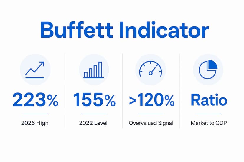
The buffett indicator is defined as the ratio of a nation’s total stock market capitalization to its gross domestic product, and Warren Buffett called it “probably the best single measure” of market valuation. Buffett introduced the metric in a December 2001 Fortune essay, and it has guided value investors ever since. As of early 2026, the U.S. ratio sits between 219% and 223.74%, a level that far exceeds any historical precedent. That number tells investors one clear thing: the market is pricing in far more future growth than the underlying economy currently produces.
What is the Buffett Indicator and how does it work?
The market cap to GDP ratio, formally known as the Buffett valuation ratio, compares the total value of all publicly traded stocks to the size of the economy producing the income that supports those stocks. The formula is straightforward: divide total market capitalization by GDP, then multiply by 100 to express the result as a percentage. A ratio above 100% means the stock market is worth more than the entire annual economic output of the country.
Warren Buffett introduced this metric because it cuts through short-term market noise and focuses on a fundamental question: are investors paying a reasonable price for the productive capacity of the economy? The answer changes slowly, which makes the ratio far more useful for long-term positioning than for day-to-day trading. Berkshire Hathaway, Buffett’s own company, has long reflected this philosophy of buying value relative to economic reality. You can track Berkshire’s current market cap to see how even the largest value-oriented firms fit into the broader ratio.

How is the Buffett Indicator calculated?
The calculation requires two inputs: total market capitalization and a measure of national economic output. Most analysts use the Wilshire 5000 index as the market cap proxy and GDP data from the Bureau of Economic Analysis as the economic output figure.
Key variables that affect the result include:
- Index selection: The Wilshire 5000 covers virtually all U.S. publicly traded stocks. Narrower indexes like the S&P 500 produce lower ratios and are not directly comparable.
- GDP vs. GNI: Buffett’s original 2001 metric used GNP, not GDP, because GNP includes income earned by Americans overseas. For the U.S., GDP and GNP differ by less than 1%, so the practical impact is small.
- Data timing: GDP figures are reported quarterly and revised multiple times. A ratio calculated using preliminary GDP data may shift after revisions are released.
- Annualization: Some providers annualize the most recent quarterly GDP figure. Others use trailing four-quarter totals. The choice can move the ratio by several percentage points.
Calculation methods vary across data providers, which means two dashboards can show meaningfully different numbers for the same date. This is not an error. It reflects legitimate methodological choices.
Pro Tip: Before comparing ratios across sources, confirm which market index and which GDP measure each provider uses. A ratio built on the Wilshire 5000 and annualized quarterly GDP is not directly comparable to one built on a narrower index and trailing annual GDP.
What does the Buffett Indicator tell investors about market valuation?
The ratio functions as a market temperature gauge. It does not predict what the market will do next week. It tells you whether current prices are historically cheap, fair, or expensive relative to the economy.
The commonly cited valuation thresholds are:
| Ratio Level | Interpretation |
|---|---|
| Below 75% | Market is undervalued relative to economic output |
| 75%–90% | Reasonable valuation range |
| 90%–115% | Modestly overvalued |
| Above 120% | Significantly overvalued |
| Above 200% | Extreme overvaluation |
A range of 75%–90% is generally considered reasonable. Readings above 120% signal that the market is pricing in aggressive future growth. Buffett himself warned that values above 200% mean investors are “playing with fire.”
“If the ratio falls to the 70% or 80% area, buying stocks is likely to work very well for you. If the ratio approaches 200% — as it did in 1999 and a part of 2000 — you are playing with fire.” — Warren Buffett, Fortune, 2001
The U.S. ratio rose from 155.43% at the end of 2022 to over 223% by January 2026. That trajectory is steeper than any prior bull market cycle on record. The concentration of Magnificent 7 stocks in the total market cap is a significant driver of this elevation, as a small number of mega-cap technology companies now represent a historically large share of total market value.
The ratio also has a statistical dimension. Analysts track how far the current reading deviates from its long-term trend line, measured in standard deviations. A reading two or more standard deviations above trend has historically preceded periods of below-average long-term returns, though the timing of any correction has varied widely.
What are the limitations of the Buffett Indicator?
The market cap gdp ratio is a powerful tool, but it carries real blind spots that investors must understand before acting on it.
The most significant limitations are:
- Interest rates are ignored: When interest rates are low, investors rationally pay higher multiples for future earnings. A ratio of 150% in a zero-rate environment may be less alarming than the same ratio in a 6% rate environment. The metric does not adjust for this.
- Structural profit margin shifts: Corporate earnings as a share of GDP have risen significantly over the past 30 years due to globalization, technology, and tax policy changes. A higher profit margin environment justifies higher market valuations, which the raw ratio does not account for.
- Globalization distortion: Large U.S. companies earn substantial revenue overseas. Their market caps reflect global earnings, but the denominator is only U.S. GDP. AI stocks with global revenue bases are a clear example of this mismatch.
- Cross-country comparisons are unreliable: Some nations have very different proportions of publicly listed companies versus private or state-owned enterprises. A country with a large state-owned sector will show a low ratio that does not reflect actual economic activity.
- It is not a crash predictor: Markets can remain overvalued for years. The ratio exceeded 140% in the late 1990s and kept climbing for several more years before the dot-com correction.
Pro Tip: Pair the Buffett valuation ratio with the Shiller CAPE ratio, the forward price-to-earnings ratio, and credit spread data. No single metric captures the full picture. Four metrics pointing in the same direction carry far more weight than one.
How can investors use the Buffett Indicator in portfolio decisions?
The ratio is most useful as a risk management tool, not a buy or sell signal. Investors should adjust risk exposure based on where the ratio sits, not try to time an exit.
A practical framework for applying the metric:
- Establish your baseline. Check the current ratio and compare it to its long-term average. A reading well above the historical mean suggests lower expected future returns, not necessarily an imminent crash.
- Adjust equity allocation gradually. At extreme readings above 200%, consider trimming equity exposure modestly and increasing allocations to cash, short-duration bonds, or international markets where valuations are lower.
- Use it to set return expectations. Historical data shows that high starting valuations correlate with lower 10-year forward returns. If the ratio is at 220%, do not plan your retirement around 10% annual equity returns.
- Monitor trend direction, not just level. A ratio falling from 220% to 190% signals improving conditions even if the absolute level remains elevated. Direction matters alongside magnitude.
- Apply internationally with caution. The ratio works best for the U.S. market, where data quality and market depth are high. For markets like Alibaba’s home market, structural differences in state ownership and reporting standards require significant adjustments before drawing conclusions.
The indicator is not precise for timing market crashes. Its value lies in signaling general valuation extremes so investors can manage risk accordingly. An investor who reduced equity exposure when the ratio crossed 200% in 2021 may have missed some gains, but also reduced their downside exposure heading into 2022’s correction.
Key Takeaways
The Buffett Indicator is the most direct single measure of whether a stock market is expensive relative to the economy, and at 220%+ in 2026, the U.S. market is at historically extreme levels that warrant reduced equity risk exposure.
| Point | Details |
|---|---|
| Definition | The ratio divides total market cap by GDP to measure overall market valuation. |
| Current level | The U.S. ratio exceeded 223% in early 2026, the highest level on record. |
| Valuation thresholds | Readings of 75%–90% are reasonable; above 120% signals overvaluation; above 200% is extreme. |
| Key limitation | The ratio ignores interest rates and structural profit margin shifts that can justify higher valuations. |
| Practical use | Use it to set return expectations and adjust risk exposure, not to time market exits. |
Why I think investors misread this metric more than any other
I have followed the Buffett Indicator for years, and the most common mistake I see is treating it as a crash alarm. It is not. It is a valuation thermometer. A high temperature tells you the patient is unwell. It does not tell you when the fever breaks.
The current reading above 220% is genuinely alarming from a historical perspective. But the same metric sat above 140% for years in the late 1990s before the dot-com bust. Investors who exited in 1997 based on “overvaluation” missed three more years of extraordinary gains. The ratio was right about the eventual outcome and useless for timing it.
What I find most useful is pairing the ratio with interest rate context. The 2021 peak above 200% occurred in a near-zero rate environment. The 2026 reading above 220% is occurring with rates meaningfully higher. That combination is more concerning than either factor alone. Higher rates reduce the present value of future earnings, which makes elevated market caps harder to justify.
My advice: use the ratio to calibrate humility, not to make dramatic portfolio moves. If you are expecting 10% annual returns from U.S. equities over the next decade while the ratio sits at 220%, you are making an optimistic bet. Adjust your expectations and your allocation accordingly. Comprehensive market cap data gives you the raw numbers to run this analysis yourself.
— Saad
Marketcaplens: track the data behind the ratio
Calculating the Buffett Indicator requires accurate, up-to-date market capitalization data. Marketcaplens tracks over 2,500 publicly traded companies with data updated multiple times daily, giving you the real-time market cap figures that feed directly into this calculation.
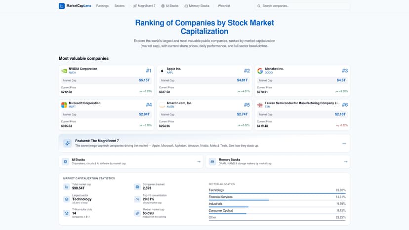
Whether you are monitoring the aggregate U.S. market or drilling into sector-level concentration, Marketcaplens provides the granular data you need. The full market cap rankings show you exactly which companies are driving the total market cap figure higher, and individual company pages let you assess how specific holdings contribute to overall valuation. For sector-specific analysis, the AI stocks tracker highlights the technology concentration that has pushed the ratio to record levels in 2026.
FAQ
What is the Buffett Indicator?
The Buffett Indicator is the ratio of total stock market capitalization to GDP, introduced by Warren Buffett in a 2001 Fortune essay as “probably the best single measure” of market valuation.
What is the current Buffett Indicator level in 2026?
As of early 2026, the U.S. Buffett Indicator sits between 219% and 223.74%, the highest level ever recorded, up from 155.43% at the end of 2022.
What ratio level signals an overvalued market?
A ratio above 120% signals significant overvaluation. Buffett specifically warned that readings above 200% mean investors are “playing with fire.”
Can the Buffett Indicator predict a stock market crash?
The ratio cannot predict the timing of a crash. Markets can remain overvalued for years, making it a tool for managing risk exposure rather than timing exits.
How does the Buffett Indicator differ from the Shiller CAPE ratio?
The Buffett Indicator compares total market cap to GDP, while the Shiller CAPE ratio compares stock prices to 10-year average inflation-adjusted earnings. Both measure valuation but from different angles, and using both together provides a more complete picture.
Recommended
For informational purposes only and is not investment advice. Do not rely on the facts, figures, ticker symbols, or other statements in this article — they may be incomplete, outdated, or incorrect, and we are not responsible for errors. See our disclaimer.