Blog
4 Rules to Choose Log or Linear Axes and When to Show Both
By MarketCapLens · Published · 10 min read

Linear scales show absolute change: the distance from 10 to 20 looks identical to the distance from 1,010 to 1,020. Log scales show relative change: that same visual gap now represents a doubling, no matter where it sits on the axis. The rule of thumb is simple: if you care how much something changed, go linear; if you care how many times it changed, go log.
TL;DR:
- Log scales are ideal for visualizing data that spans multiple orders of magnitude or emphasizes percentage change over absolute difference.
- When datasets include zero or negative values, linear scales are the only option, or alternative chart types must be used.
- A steep line on a linear chart indicates a large absolute change, while on a log chart it signifies consistent percentage growth.
- Interactive charts with toggle options help prevent misinterpretation by showing both linear and log views, especially for audiences unfamiliar with log scales.
- Fields like finance, earthquakes, sound, chemistry, and environmental science commonly use log scales due to the exponential or multiplicative nature of their data.
MarketcaplensExplore Market Trends ClearlyCompare market capitalization, share prices, historical data, and sector allocations across thousands of public companies.Explore MarketCapLens
Table of Contents
- Log Scale vs Linear Scale: What Each One Actually Shows
- How Do You Decide Between Linear and Log Scale?
- Why Do Exponential Trends Look Straight on a Log Axis?
- What Are the Downsides of a Logarithmic Scale?
- How Do You Convert Data to a Log Scale?
- Where Do Log Scales Show Up in the Real World?
- What Are the Best Practices for Presenting Log Charts?
- Why Market-Cap Comparisons Need Both Views
- When Should You Trust the Chart Over the Instinct?
- Sources
- FAQ
Log Scale vs Linear Scale: What Each One Actually Shows
A linear axis divides space into equal steps, so 0, 10, 20, and 30 sit the same distance apart. A logarithmic scale instead spaces values by equal ratios, so 1, 10, 100, and 1,000 land the same distance apart even though the gap between them grows enormously each time.
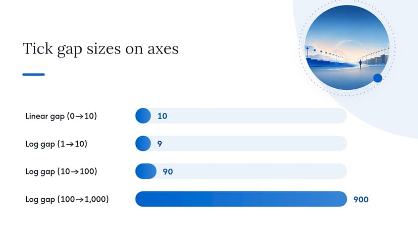
That difference changes how you read a slope. On a linear chart, a steep line means a big absolute jump. A curve that bends upward on a log chart means growth is accelerating, not just large.
You can often spot which scale you’re looking at from the tick marks alone: evenly spaced labels like 0, 25, 50, 75 signal linear; labels like 1, 10, 100, 1,000 or 2, 4, 8, 16 signal log.
- Linear: equal spacing = equal absolute difference
- Log: equal spacing = equal multiplicative difference (a fixed “times” factor)
- A rising straight line on log axes = constant percentage growth
- Mismatched, unevenly-spaced tick labels are the fastest visual clue you’re on a log axis
| Feature | Linear scale | Log scale |
|---|---|---|
| Axis spacing | Equal absolute steps | Equal ratio steps |
| Best for | Exact values, narrow ranges | Wide ranges, percent change |
| Straight line means | Constant absolute rate | Constant percentage rate |
| Zero/negative values | Supported | Not supported |
| Reading effort | Intuitive for most audiences | Requires some explanation |
How Do You Decide Between Linear and Log Scale?
Run your data through a short mental checklist before you build the chart.
- Check the range. If your values span more than two or three orders of magnitude (say, 5 to 50,000), a linear axis will crush the small values into an unreadable line near zero. That’s when a logarithmic scale earns its place.
- Check for zeros or negatives. Log scales can’t plot them. If your data includes losses, deficits, or true zero values, linear is your only option, or you need a workaround.
- Ask whether percent change matters more than absolute change. Comparing investment returns, population growth rates, or infection rates? Percent change is usually the story, and log makes that story visible.
- Consider your audience. General readers understand linear axes instinctively. Financial analysts and scientists tend to read log scales fluently.
If you’re genuinely torn, don’t guess. Offer both. An interactive toggle between linear and log views lets readers pick their own lens, and it protects you from misleading anyone by default.
As a rough shortcut: finance and long-term price tracking lean log, most physical measurements and everyday comparisons lean linear, and public health communication usually defaults to linear unless the outbreak data specifically calls for rate comparisons.
Pro Tip: When you’re not sure which scale tells the truer story, build the chart both ways before you publish anything. If the story changes dramatically between the two, that’s a sign your data needs more context, not just a different axis.
Why Do Exponential Trends Look Straight on a Log Axis?
An order of magnitude is a jump by a power of ten. Going from 1 to 10 is one order of magnitude; from 10 to 100 is another; from 100 to 1,000 is a third. A log scale with base 10 places each of those milestones at equal intervals, which is why it compresses huge ranges into a readable chart.
The math behind this is straightforward once you see it. Exponential growth follows the form y = a·b^x, where b is the growth factor. Take the logarithm of both sides and you get log(y) = log(a) + x·log(b), which is the equation of a straight line. That’s the entire trick: a log axis turns multiplication into addition, so a curve that bends sharply upward on a linear chart flattens into a clean diagonal line on a semi-log plot.
- Base 10 is most common for general-purpose charts because it lines up with everyday number sense
- Base 2 shows up in computing and biology (cell doubling, data storage)
- The natural log (base e) appears constantly in continuous growth models and statistics
One distinction trips up more people than any other: applying a log axis to a chart is a display choice, but log-transforming your data before modeling is a statistical choice. Switching the axis makes a chart easier to read. Transforming the actual values changes what a regression, correlation, or curve fit calculates. Confusing the two can produce a chart that looks right and an analysis that’s wrong.
What Are the Downsides of a Logarithmic Scale?
Log scales have three real limitations, and pretending they don’t exist is how charts end up misleading people.
First, they simply cannot show zero or negative numbers, because a logarithm of zero or a negative value is undefined. Datasets with losses, deficits, or literal zero counts need a workaround before they can go on a log axis.
- Plot zero-value points on a separate linear inset or annotate them as text
- Add a small constant to every value before transforming (common but distorts small numbers disproportionately)
- Switch to a different chart type entirely, like a bar chart, for that segment of the data
Second, log scales can flatten meaningful early differences while making late-stage noise look dramatic, or the reverse. A 5-point wobble near the bottom of a log axis can look identical to a 500-point wobble near the top, even though one is far more significant in absolute terms.
Third, general audiences often misread log charts as linear, assuming equal visual gaps mean equal absolute change. That’s the single most common misinterpretation in public communication.
Pro Tip: Always label the axis explicitly as “log scale” and add a one-line caption explaining what the tick marks represent. A silent log axis is how well-meaning charts become accidentally deceptive.
How Do You Convert Data to a Log Scale?
Converting linear data for a log scale isn’t complicated, but skipping a step causes real errors.
- Inspect your range and check for zeros or negatives first. This single check determines whether you can use a log axis at all.
- Decide how to handle problem values. Remove them, flag them separately, add a small offset, or keep that portion of the chart linear.
- Choose your tool’s method. Most charting software (Excel, Highcharts, Tableau, Flourish) lets you flip an axis property to logarithmic without touching your underlying numbers. That’s a display transform only.
- For statistical work, transform the actual values. Compute log(value) in your dataset before running a regression or correlation, since changing the axis alone doesn’t change the numbers your model sees.
- Re-check your interpretation. Slopes, correlations, and R-squared values on log-transformed data describe percentage relationships, not absolute ones. State that explicitly in your write-up.
Where Do Log Scales Show Up in the Real World?
Certain fields reach for log scales constantly because their underlying phenomena grow multiplicatively rather than additively.
- Finance: Long-term stock price charts frequently use log scales because they plot percentage moves consistently. A stock rising from $10 to $20 and one rising from $100 to $200 both represent a 100% gain, and a log chart shows them as the same size move. A linear chart would make the second move look ten times more dramatic, which misrepresents the actual return.
- Earthquakes: The Richter scale is logarithmic, so each whole-number increase represents roughly 10 times more ground motion, not 10% more.
- Sound: Decibels use a log scale because human hearing perceives loudness multiplicatively, not additively.
- Chemistry: pH is a log scale of hydrogen ion concentration, which is why a two-point pH shift represents a hundredfold change in acidity.
- Environmental science: Contaminant concentrations and particle sizes often span several orders of magnitude, making log axes the only readable option.
These fields aren’t picking log scales for style. Their underlying data follows power-law or exponential patterns, and a linear axis would flatten the small values into invisibility.
What Are the Best Practices for Presenting Log Charts?
A log chart only works if the audience understands what they’re looking at. A few habits separate a clear chart from a confusing one.
- Label the axis explicitly as “log scale” rather than assuming readers will notice
- Use tick labels that show the actual values or clear ratios (1, 10, 100) instead of unlabeled gridlines
- Offer a toggle between linear and log views in any interactive chart, and keep the scale consistent when comparing multiple charts side by side
- Add a short caption explaining what equal spacing means on that particular chart
- Avoid log scales entirely when zero or negative values are central to the story, since forcing them onto a log axis usually means hiding data
Testing both scales before publishing is the fastest way to catch a misleading default. If a pattern that looks dramatic on linear disappears on log, or vice versa, that discrepancy is worth explaining to your reader rather than hiding behind a single view.
Pro Tip: Interactive embeds with built-in scale controls, like the kind used in ticker tape widgets, make the linear/log decision the reader’s problem to solve instead of yours. That’s often the most honest option available.
Why Market-Cap Comparisons Need Both Views
Comparing a $50 billion company to a $2 trillion company on a linear chart makes the smaller company’s price movement invisible by comparison, even when its percentage gain is larger. That’s precisely why percent-based, log-style thinking matters across market-cap tiers: a company doubling from $10 billion to $20 billion represents the same relative achievement as one doubling from $500 billion to $1 trillion, even though the dollar amounts look wildly different.
A platform tracking thousands of companies with frequently refreshed data means both absolute price movement and relative, percentage-based performance are worth examining depending on the question you’re asking. For long-term trend analysis across sectors and market-cap tiers, relative comparisons tend to reveal more than raw dollar swings, and pairing that with historical data on how market cap actually shifts over time gives a fuller picture than either view alone.
When Should You Trust the Chart Over the Instinct?
Default to showing both scales, or at least offering a toggle, whenever your audience includes people outside your immediate field. Reach for log the moment relative change across wide-ranging magnitudes is the actual point of the chart, not an afterthought. If your dataset has zeros, negative values, or needs a transformation before modeling, that’s the moment to loop in a statistician rather than guessing at a workaround.
— MarketCapLens
Sources
For a deeper technical grounding, Golden Software’s comparison covers the core decision logic, while Flourish’s guide focuses on audience-facing design choices like toggles. The Pennsylvania Department of Health’s reference applies these principles specifically to public health communication, and GraphPad’s documentation explains the axis-versus-transformation distinction in more statistical depth.
- Log scale vs linear scale — Golden Software
- Linear vs logarithmic: choosing the right scale for your story — Flourish
- Logarithmic Price Scale vs. Linear Price Scale — Investopedia
- Tools of the Trade: Arithmetic vs. Logarithmic Line Charts — Pennsylvania Department of Health
- When to use a logarithmic axis — GraphPad Prism documentation
FAQ
When should you use a log scale?
Use a log scale when your data spans several orders of magnitude or when percentage change matters more than raw difference, such as long-term stock price tracking or earthquake magnitude comparisons. If your values stay within a narrow range and readers need exact absolute figures, stick with linear.
How do you convert a linear scale to a log scale?
For visualization, most charting tools let you flip the axis type to logarithmic without altering your underlying numbers. For statistical modeling, you need to actually compute log(value) for each data point beforehand, since the axis change alone doesn’t affect the numbers a model calculates.
What are the disadvantages of using a logarithmic scale?
Log scales can’t display zero or negative values, they can make small early changes look bigger or smaller than they really are relative to later ones, and general audiences often misread equal spacing as equal absolute change rather than equal ratio change. All three problems are manageable with clear labeling and, when needed, a linear inset for problematic data points.
Is linear faster to read than logarithmic?
For most people, yes. A linear scale is more intuitive because equal spacing matches equal absolute difference, which is how most people naturally think about numbers. Log scales require a bit of upfront explanation, which is why offering a toggle or a clear caption matters so much when your audience isn’t already familiar with logarithmic charts.
Recommended
For informational purposes only and is not investment advice. Do not rely on the facts, figures, ticker symbols, or other statements in this article — they may be incomplete, outdated, or incorrect, and we are not responsible for errors. See our disclaimer.