Beginners: OHLC vs Candlestick in 5 Steps and a Heikin-Ashi Warning
By MarketCapLens · Published · 8 min read
Candlestick and OHLC bar charts plot the exact same numbers: open, high, low, and close for each period. The difference is purely visual. Candlesticks use a filled body and color to show direction at a glance, which makes them better for spotting patterns and sentiment shifts. OHLC bars use thin vertical lines with side ticks, giving a cleaner look that suits plain trend inspection.
TL;DR:
- Candlestick charts make price action clearer through body color and size, making pattern recognition faster, especially for intraday traders.
- OHLC bars provide a cleaner, less noisy view suitable for long-term trend analysis but are slower to interpret at a glance.
- Candlesticks are more effective for quick sentiment checks, while OHLC bars excel in detailed historical comparison and structural trend review.
- Using a combination of charts—scanning with candlesticks, verifying with OHLC, and confirming with Heikin-Ashi—reduces false signals and improves trend clarity.
- Beginners find candlesticks easier to interpret initially, but seasoned traders may prefer OHLC bars for their straightforward, clutter-free trend overview.
Marketcaplensmarketcaplens.comRead Market Trends With More ContextTrack share prices, historical data, and sector breakdowns across thousands of public companies in one comprehensive market view.Visit MarketCapLens
Table of Contents
- 1. What are OHLC and candlestick charts made of?
- 2. How the same price data looks different on each chart
- 3. Strengths, weaknesses, and when to use each chart
- 4. How to read a candle or bar in 5 quick steps
- 5. What changes when you switch to Heikin-Ashi candles
- 6. How traders blend chart types in practice
- Practice reading real charts with MarketCapLens
- FAQ
- Sources
1. What are OHLC and candlestick charts made of?
Both chart types are built from four data points collected for every time period you choose, whether that’s one minute or one month: the open, high, low, and close price.
An OHLC bar chart draws this as a single vertical line stretching from the low to the high. A short tick on the left marks the open and a short tick on the right marks the close. No color is needed because the tick positions tell you everything.
A candlestick chart turns the same four numbers into a shape with a body and shadows. The body spans the distance between the open and the close, and it’s usually filled in one color when the close is lower than the open and another when it’s higher. Thin lines above and below the body, called wicks or shadows, show the high and low for that period.
- OHLC bars rely on tick position alone, with no fill or color.
- Candlesticks rely on body size, body color, and wick length together.
- Both charts refresh with a new bar or candle every time a period closes.
The raw inputs never change. According to Investopedia, candlestick charts display the same price points as bar charts, just with a body and shadows added for readability.
2. How the same price data looks different on each chart
Picture one trading session where a stock opens at $50, climbs to $54, dips to $49, and closes at $53. On an OHLC bar, that session is a single vertical line from $49 to $54, with a short tick at $50 on the left and another at $53 on the right. You have to compare tick heights to judge how the session behaved.
On a candlestick, the same session becomes a tall body stretching from $50 to $53, likely filled in a color that signals a close above the open, with a short lower wick reaching to $49 and almost no upper wick since the high came close to the close. The shape alone tells you buyers pushed the price up and held most of their gains.
Body size signals momentum: a long body means a strong directional move, while a short body suggests indecision. Long wicks on either end often point to rejection, where the price tried to move further but got pushed back.
- A long body with short wicks usually signals strong, one-directional momentum.
- A small body with long wicks on both sides usually signals indecision or a tug-of-war.
- A long wick with little body on one side can flag a rejection at that price level.
On short timeframes or in volatile markets, candlestick charts can get visually busy because every wick and color shift draws the eye. Research on OHLC charts notes that bar charts reduce that visual noise, which is why some traders switch to bars when reviewing long historical stretches.
Pro Tip: Zoom out to a daily or weekly timeframe before judging whether a candle pattern is meaningful. Patterns on a 1-minute chart are far noisier than the same shapes on a daily chart.
3. Strengths, weaknesses, and when to use each chart
Neither chart format is better in every situation. The right one depends on what you’re trying to see.
- Candlesticks excel at quick sentiment reads: the body color and size let you judge who won a session, buyers or sellers, in under a second.
- Candlesticks carry more noise risk: a single candle can look dramatic but mean little without context, which is why academic research on candlestick patterns finds predictive reliability varies by pattern, market, and how success is measured.
- OHLC bars shine for clean historical comparisons: with no fill color competing for attention, long price series are easier to scan for structural trends.
- OHLC bars are less intuitive at a glance: you need to check tick positions rather than read a color, which slows down fast sentiment checks.
- A practical rule: use candlesticks for intraday scanning and pattern checks, and use OHLC bars for printed reports or calm, longer-term reviews where color would just add clutter.
Mixing formats by task, rather than picking one forever, tends to serve beginners better than committing to a single style.
4. How to read a candle or bar in 5 quick steps
- Confirm the timeframe and the OHLC values. Know whether you’re looking at a 5-minute, daily, or weekly candle before drawing any conclusion.
- Read the body and wicks. A large body shows strength in one direction; long wicks show a price level that got rejected.
- Compare the close to context. Check the close against the prior period’s close and against a simple moving average to see if the move fits the broader trend.
- Look for confirmation. A single candle rarely tells the full story, so check volume, RSI, or the next candle before treating it as a signal, since statistical testing of candlestick patterns shows single-pattern reliability often depends on added confirmation.
- Practice on historical charts. Pull up past data on a ticker like Apple Inc. (AAPL) and track how often a pattern you spotted actually played out.
Pro Tip: Keep a simple log of the patterns you test and whether price moved as expected. A few weeks of notes will teach you more about reliability than any single tutorial.
5. What changes when you switch to Heikin-Ashi candles
Heikin-Ashi candles look like regular candlesticks but are built differently. Each Heikin-Ashi close is an average of that period’s open, high, low, and close, and each open is based on the prior Heikin-Ashi candle. The result is a synthetic series that smooths out noise, as OANDA’s explanation of Heikin-Ashi describes.
- Heikin-Ashi helps you spot sustained trends by reducing the frequent color flips you see on raw candles.
- It hurts precision: the values are averaged, not actual traded prices, so they lag and can mismatch real entry or exit levels.
- Use raw candlesticks when you need exact prices for orders, and Heikin-Ashi when your goal is reading the shape of a trend.
6. How traders blend chart types in practice
A common workflow looks like this: scan a watchlist with candlesticks to spot setups quickly, then validate with an indicator or an OHLC bar view to check the move against a cleaner baseline, then switch to Heikin-Ashi if you want confirmation that a trend has real persistence rather than short-term noise. Combining views this way cuts down on false positives from any single chart. A short habit worth building is pairing any pattern test with a sector or indicator check, similar to how a sector rotation strategy layers multiple signals before acting on one.
— MarketCapLens
Practice reading real charts with MarketCapLens
Reading about candles and bars only goes so far. We built MarketCapLens to give you real-time OHLC values and historical price series across more than 2,500 companies, so you can test everything covered above on live data instead of a textbook example.
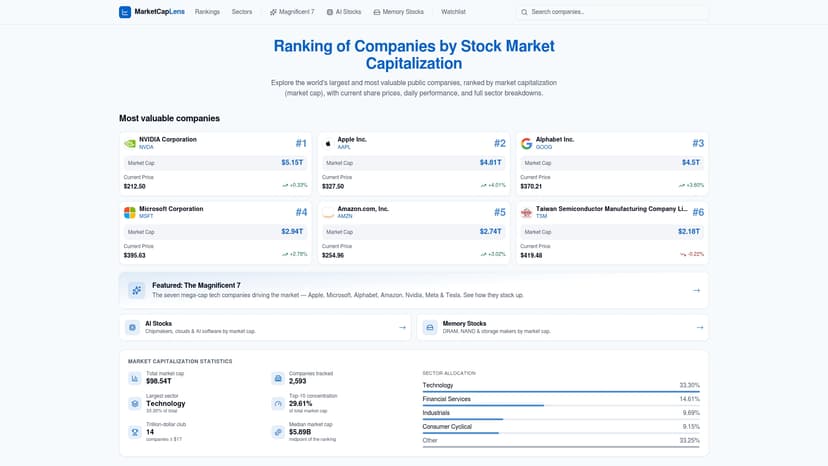
Pick a ticker you already know, pull up its historical range, and compare how the same session looks as a candle versus a bar. Our company pages carry sector context alongside the price data, so you can see how a single candle fits into a broader trend. Start by browsing market cap rankings and picking a company to track for a week.
FAQ
What is OHLC in candlesticks?
OHLC stands for open, high, low, and close, the four price points every candlestick represents for its period. The candlestick’s body shows the open and close, while its wicks show the high and low, as Wikipedia’s OHLC entry explains.
Is Renko better than candlestick?
Neither is strictly better; Renko charts filter out time and focus purely on price movement, which removes noise but also hides exactly when moves happened. Candlesticks keep the time axis intact, which makes them more useful when you need to know when a pattern formed, not just that it happened.
Is a line chart better than a candlestick?
A line chart, which plots only closing prices, is simpler and less cluttered, making it useful for a quick glance at overall direction. Candlesticks add the open, high, and low for each period, giving you far more detail for spotting momentum, rejection, and sentiment shifts within a session.
Which candlestick pattern is most accurate?
No single pattern is reliably accurate across every market and timeframe; academic testing of candlestick predictive power finds results vary by pattern and by how success is defined. Most practitioners treat any pattern as a starting point to confirm with volume or other indicators, not a standalone signal.
Should beginners start with candlesticks or OHLC bars?
Most beginners find candlesticks easier to start with because the color and body size give an immediate read on direction and strength. OHLC bars become more useful once you’re comfortable scanning longer historical ranges where a cleaner, less colorful view helps you focus on structure.
Sources
For informational purposes only and is not investment advice. Do not rely on the facts, figures, ticker symbols, or other statements in this article — they may be incomplete, outdated, or incorrect, and we are not responsible for errors. See our disclaimer.