Read US vs Global Market Cap with World Bank and Live MarketCapLens
By MarketCapLens · Published · 11 min read
Using the World Bank’s broad listed-market series, US-listed companies carried roughly $68.9 trillion in market capitalization against a $141.3 trillion global total in 2025, about 48.8%. That figure reflects broad listed-company totals. Investable index weights, like MSCI ACWI, often put the US closer to two-thirds of the global equity universe because they measure a different thing entirely.
TL;DR:
- US-listed companies account for about 48.8% of the global market capitalization in 2025, but investable index weights favor the US even more, nearing two-thirds.
- The reported US share varies depending on whether measurements include broad listed totals or tradable float, with the latter typically giving a higher US weighting.
- Currency fluctuations and cross-listings can distort dollar-denominated market cap comparisons, especially over multi-year periods.
- Market-cap-to-GDP ratios differ widely across regions, with North America at around 222%, serving as a structural indicator rather than a timing signal.
- Sector composition influences market size insights, as the US is heavily weighted in technology, while other markets may concentrate more in financials or energy.
MarketcaplensTrack Global Market Cap LiveCompare company rankings, market trends, historic data, and sector allocations across thousands of public companies in one place.Explore MarketCapLens
Table of Contents
- Current Snapshot: How Big Is the Global Equity Market Right Now?
- Why the US Share Depends on Which Measure You Pick
- How the US Share Has Shifted Over the Decades
- How to Use This Metric Without Getting Burned
- MarketCapLens Data Snapshot: Top Companies and Sector Weight
- Measurement Caveats You Need to Check Before Trusting a Number
- Market-Cap-to-GDP Ratio: A Useful Check, Not a Verdict
- Why Sector Mix Changes What a Market-Cap Comparison Actually Tells You
- How Emerging Markets Reshape the Global Total
- Currency Swings Can Move the Numbers Without Moving a Single Stock
- What This Means for How You Weight Your Own Portfolio
- Where to Check Live Rankings and Sector Breakdowns
- FAQ
- Sources
Current Snapshot: How Big Is the Global Equity Market Right Now?
The World Bank’s 2025 data puts global listed domestic-company market capitalization at $141.3 trillion, with the US representing a significant portion of that total. No other single country comes close to matching that figure, though China, Japan, and a handful of European markets round out the next tier of scale.
A few things shape how you should read any ranking built on these numbers:
- The World Bank series tracks domestic listed companies by country, not where investors actually hold their money.
- Figures are denominated in US dollars, so currency swings in other markets can move a country’s dollar-value ranking without any change in local share prices.
- Totals update on the World Bank’s own schedule, which can lag real-time exchange data by months.
| Market | Approximate Share of Global Listed Cap |
|---|---|
| United States | ~48.8% |
| Rest of world (combined) | 48.8% |
That near-even split is the headline most people remember, and it is also the number most likely to get misquoted once it is pulled out of context.
Why the US Share Depends on Which Measure You Pick
The World Bank and World Federation of Exchanges series count the total market value of domestically listed companies. That is a broad snapshot of listed wealth, not a portfolio you can buy. Investable indexes like MSCI ACWI start from that same universe, then filter out shares that are not actually tradable by foreign investors: large government stakes, restricted share classes, and thin free float all get trimmed.
That filtering tends to shrink some countries’ weights more than others, which is part of why index-based US shares land higher than broad listed totals.
- Broad listed totals answer “how much value is listed here,” full stop.
- Investable index weights answer “how much of the tradable global float sits here.”
- Listing venue and company domicile are not always the same thing, which matters for cross-listed firms and ADRs.
A company incorporated abroad but listed on a US exchange through an ADR can show up differently depending on whose rulebook you are reading, inflating one country’s count and deflating another’s.
Pro Tip: Before comparing two “US share of global market” statistics, check whether both are measuring domestic listings or investable index weight. They are rarely the same number.
How the US Share Has Shifted Over the Decades
The US has not always held anywhere near half of global listed value, and it has not held a steady share even in recent decades. The long arc runs through a few recognizable phases:
- Mid-20th century dominance: US markets represented an outsized share of global listed value in the postwar decades, when much of Europe and Asia was still rebuilding industrial capacity.
- Japan and emerging-market rise: Japan’s equity boom in the 1980s and the growth of emerging markets in the 1990s and 2000s pulled global share away from the US, even as US companies kept growing in absolute terms.
- Tech-era resurgence: The rise of large US technology companies, a steady wave of US IPOs and listings, and sustained corporate buyback activity pushed the US share back upward over the past decade.
Exchange-level concentration reinforces the pattern: WFE market statistics show Nasdaq and NYSE together account for the bulk of US-listed market capitalization, giving a small number of venues outsized influence on the country total. It is worth remembering that a rising US dollar value does not automatically mean a rising US share. When non-US markets grow faster, or when currency moves inflate their dollar-denominated totals, the US share can shrink even while US markets post solid gains.
How to Use This Metric Without Getting Burned
A country’s share of global market cap tells you the relative scale of its listed markets at a point in time. It does not tell you investability, earnings quality, or future returns, and it says nothing about markets that are large in GDP terms but thinly listed on public exchanges.
Three rules keep you out of trouble:
- Pick one series (World Bank, WFE, or an index provider) and stick with it across any comparison you make.
- Match the denominator to your actual decision: a broad listed total is the wrong yardstick for building an investable portfolio.
- Watch for double counting from cross-listed securities and overlapping exchange tables.
Key figure: Global listed-company market capitalization ran at roughly 148.5% of world GDP in 2025, a reminder that listed equity value and economic output are related but distinct measures.
MarketCapLens Data Snapshot: Top Companies and Sector Weight
This article draws upon data covering thousands of publicly listed companies, with figures refreshed multiple times daily, which gives you a live complement to the slower-moving official series above. Where the World Bank and WFE numbers answer “how big is the whole market,” our rankings answer “which specific companies and sectors are driving that total right now.”
- Our top companies by market cap rankings update daily and show concentration among a handful of mega-cap names.
- Sector pages break down allocation by industry group, letting you see how much of total value sits in technology versus other categories.
- Company profiles, like the ones for Meta Platforms and Palantir Technologies, show individual market caps alongside daily price moves.
| Data layer | What it shows |
|---|---|
| World Bank / WFE totals | Country-level listed market capitalization |
| MarketCapLens rankings | Live company-level and sector-level breakdowns |
Reading both layers together is the difference between knowing the score and understanding how it got there.
Measurement Caveats You Need to Check Before Trusting a Number
Country market-cap comparisons break down quietly, often through definitional choices nobody mentions in the headline. Listing location and company domicile are the most common trap: a company can list its shares on a US exchange while being headquartered and taxed elsewhere, and different datasets handle that case differently.
Currency conversion adds another layer. Every major series expresses country totals in US dollars, so a strengthening dollar can shrink the reported value of non-US markets even when local share prices are flat or rising. Cross-listings and ADRs compound the issue: a company listed on both a home exchange and a US exchange risks being counted twice if a table does not specify domestic listings only.
Free float and index eligibility matter just as much. A country can have a large headline market cap while much of it sits in government or founder-controlled shares that never trade, which is exactly why investable index weights (used for building portfolios) diverge from broad listed totals (used for measuring market size). The WFE’s own tables flag this directly, separating domestic listings from foreign listings so readers do not accidentally add overlapping totals together.
None of these caveats make any single number wrong. They just mean the number only answers the specific question its methodology was built to answer, and swapping in a different source mid-comparison quietly swaps the question too.
Market-Cap-to-GDP Ratio: A Useful Check, Not a Verdict
Market-cap-to-GDP, sometimes called the “Buffett Indicator,” compares the total value of listed equities to a country’s economic output. World Bank data for 2025 puts the global ratio at roughly 148.5%, while North America’s ratio runs far higher, around 222.3%.
A ratio well below 100% can mean either an undervalued market or, just as often, an economy where large companies simply are not publicly listed, which is common in markets with heavy state ownership or family-controlled conglomerates that stay private.
The limitation is straightforward: market-cap-to-GDP is a structural snapshot, not a timing signal. A high ratio can persist for years without a correction, and a low ratio does not guarantee outperformance. It works best as one input alongside valuation multiples and earnings trends, never as a standalone buy or sell trigger.
Why Sector Mix Changes What a Market-Cap Comparison Actually Tells You
Two markets with similar total market capitalization can have completely different risk and growth profiles depending on what sectors make up that total. The US listed market carries a heavy weight in technology, communication services, and consumer-facing mega-caps. Many non-US markets carry more weight in financials, energy, materials, and industrials.
That mix difference means a straight “US versus rest of world” percentage comparison is really comparing two different baskets of economic exposure, not just two different sizes. A reader using the US share as a proxy for “how exposed should my portfolio be to technology” is asking a sector question while looking at a country statistic, and the two do not map cleanly onto each other.
Our sector pages let you check this directly: compare the technology sector’s share of US-listed capitalization against the basic materials sector, which skews more heavily toward non-US listings, and the structural difference becomes obvious fast.
How Emerging Markets Reshape the Global Total
Emerging markets add a layer of volatility to any country-share comparison that developed markets rarely produce on their own. Rapid growth phases in these markets, often tied to industrialization, commodity cycles, or a wave of new listings, can shift the global denominator meaningfully in a single year without any change in US market behavior.
WFE data on 2025 growth reported that global market capitalization rose sharply across the year, with every region posting strong gains. When growth is broad-based like that, a country’s share of the global total can hold steady, rise, or fall depending entirely on relative pace, not absolute performance. A market can grow in dollar terms and still lose global share if other regions grow faster.
This is the mechanism behind a lot of confusing headlines: “US share falls” and “US market hits a new high” can both be true in the same reporting period, because one statement is about relative share and the other is about absolute value.
Currency Swings Can Move the Numbers Without Moving a Single Stock
Every country-level market-cap comparison discussed here converts local values into US dollars, which means currency movement alone can shift the reported numbers. A country’s equity market can stay completely flat in its own currency while its dollar-denominated market cap rises or falls purely because of exchange-rate movement.
This matters most over multi-year comparisons. A period of sustained dollar strength tends to shrink the reported dollar value of non-US markets, which can make the US share look like it is rising even if local markets abroad are performing just as well as US markets in their own currencies. The reverse holds during periods of dollar weakness.
Anyone tracking US share trends over a decade or more should treat currency as a separate variable from actual market performance, not as noise to be ignored. A sharp move in the US share figure over a short window is worth checking against currency charts before assuming it reflects a genuine shift in company fundamentals or investor sentiment.
What This Means for How You Weight Your Own Portfolio
A country’s share of global market cap is a measurement of listed market size, not an investment recommendation. Using the headline US share to justify a large reweighting of your portfolio confuses a descriptive statistic with a forward-looking signal, and the two are not the same thing.
The more useful approach matches your benchmark to your actual decision: broad listed totals for understanding market structure, investable index weights for building allocation. Reacting to a single percentage, without checking which series produced it, is how portfolios end up chasing a number instead of a strategy.
— MarketCapLens
Where to Check Live Rankings and Sector Breakdowns
We built our market cap rankings to put live company and sector data next to the kind of official totals covered above, so you are never stuck with a single stale percentage. Coverage runs across more than 2,500 companies, refreshed multiple times a day, with sector pages that let you drill into exactly where that value sits.
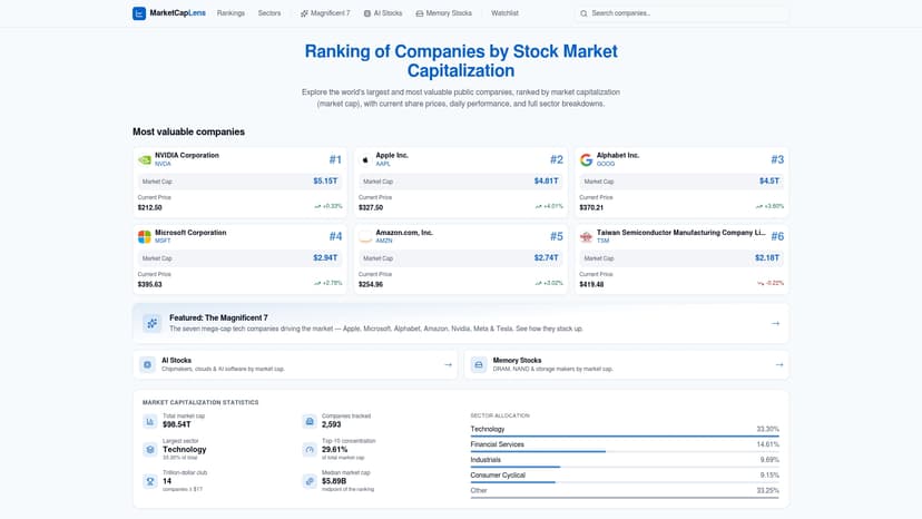
If you want the plain-English version of how any of this is calculated, our market capitalization primer walks through the math before you dive into the rankings. Start with the live top companies list and work from there.
FAQ
What country has the largest stock market in the world?
The United States has the largest listed equity market by total value, holding roughly 48.8% of the global total according to World Bank data for 2025. No other single country holds a comparable share of broad listed market capitalization.
Is market cap a good investment indicator?
Market cap measures the size and relative scale of a listed company or market, not its future returns or earnings quality. It works best alongside valuation ratios like market-cap-to-GDP and sector analysis rather than as a standalone signal.
How much of the global market does the US control?
Based on broad listed totals, the US accounted for about 48.8% of the $141.3 trillion global listed-equity market in 2025, per World Bank figures. Investable index measures, like MSCI ACWI, often show a higher US weight because they filter for tradable free float.
What are the best non-US stocks to buy?
This depends on your goals, risk tolerance, and sector preferences, so there is no single universal answer. Our sector pages let you compare non-US companies by market cap and industry to research options that fit your own criteria.
Sources
- World Bank — market capitalization of listed domestic companies (WFE series)
- World Bank Databank — market-cap-to-GDP ratio series metadata
- Focus
Recommended
For informational purposes only and is not investment advice. Do not rely on the facts, figures, ticker symbols, or other statements in this article — they may be incomplete, outdated, or incorrect, and we are not responsible for errors. See our disclaimer.